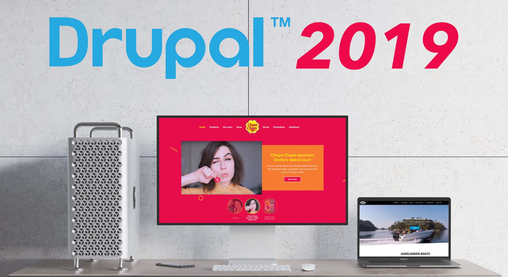
Why Drupal is the best choice in 2019? Learn from these incredible Drupal 8 case studies
Every day there is a large number of websites that are popping up on the internet. However, some websites stand out more than the others, when it comes to the user experience provided. After seeing this list of awesome Drupal 8 website examples, you will know why Drupal is the best choice to deliver an unforgettable digital experience to your audience.
Part of this selection of awesome websites are our personal selection of favorites from the 2019 Drupal Splash Awards.
1. Chupa Chups
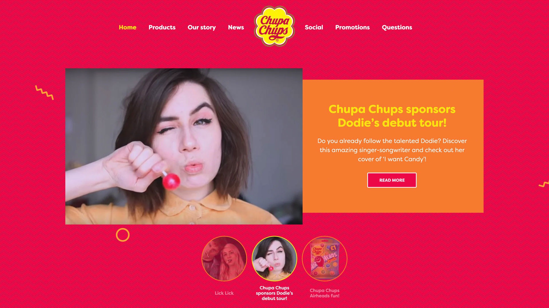
The first awesome Drupal website belongs to Chupa Chups. Chupa Chups had to redesign its website to encompass the vision of “Forever Fun”. On top of that, they had to build a backbone platform that can host all the international Chupa Chups website, which are over 100.
The challenge was to be able to incorporate the needs of their buyer personas in the new website design. In order to do that, they had to make sure that the chosen design was in concordance with them, as well to make sure that it is in line with the different cultural expectations all over the world.
In order to be able to pull the redesign of the website off, Chupa Chups had decided to use Drupal 8. This enables the brand to have a high level of flexibility, while not having to compromise on standardization. By using Drupal 8, Chupa Chups has aimed to centralize the platform, gaining the advantage of easy scalability. The result was a visually stunning website that is in line with the goals that the company has set for the project.
You can read more here.
2. Mintz
Mintz is a general practice, full-service law firm that is employing over 450 attorneys worldwide. The company has noticed that there is a need for a rebranding that can better reflect the hardworking and forward-thinking culture, with which the company guides its clients through times of unprecedented transformation.
The rebrand was reflected through the launch of a new website that better reflected the culture at Mintz. Among the most notable rebranding changes was the shortening of the name for marketing purposes, as well as a change of the logo. The change received tons of positive feedback from the community as well as the industry.
You can read more here.
3. Panasonic North America
.
Panasonic is one of the biggest electronics manufacturers in the world. However, the website was no longer reflecting the evolving brand of Panasonic. In other words, the website was not holding up with the times anymore.
In order to be able to reflect the constantly evolving brand of Panasonic, they had to go for an API first approach. On top of that, they had to put the customer at the center of the project, making sure that the redesign would be in line with customer expectations.
After 18 months of development, the website was finally ready to launch. The API focused approach resulted in the ability to easily integrate other marketing tools. Those tools let the company have better customer data-driven insights. These insights can be used to deliver a better-tailored customer experience.
You can read more here.
4. COIT
COIT is a family owned specialty cleaning business that was founded in the year 1945 in California. With over 100 offices throughout the U.S. and Canada, they are serving over 12 million homes. Despite this, their website was really behind the times.
In order to tackle this challenge, a capable CMS had to be chosen. The business had a corporate website with 100+ microsites. Because of the big amount of websites that had to be handled, Drupal 8 was chosen. Drupal 8 allowed COIT to tackle the complexity of the task, while also being able to deliver on the desired visual performance.
The result of this is a brand new website redesign. Geolocation was also added to the website, in order to redirect the customers to the nearest franchise location. Moreover, the new content strategy allows for better-optimized SEO, while also having deeper conversion tracking. These changes have resulted in a better online experience for consumers.
You can read more here.
5. Rotary Foundation
The Rotary Foundation is a non-profit organization that is supporting the efforts of Rotary International to achieve world understanding and peace through international humanitarian, educational and cultural exchange programs. The problems started to show when the people that were willing to make donations to the website had to go through a frustratingly long process.
In order to fix this problem, Drupal was chosen. It was chosen because the company already had existing Drupal websites. This made it easier to be able to develop an app that can handle the transactions in a seamless way. On top of that, the app also had to integrate with other internal processes such as finance and membership.
The development of such an app has resulted in positive feedback. It is highly customizable which lets content creators be able to effortlessly deliver their content to the audience. Moreover, donor satisfaction has never been higher.
You can read more here.
6. WWF Switzerland
World Wide Fund is a non-governmental organization that works in wildlife preservation and aims to reduce the human impact on the environment. In order to be able to achieve its goal, WWF decided that they need a strong online presence, basically, a website that can reflect the values that the company stands for. The website has to be able to convince and educate the audience about the impact of human activity on the environment and wildlife. However, in its current state, the website wasn’t able to spark any emotion in its audience, it was like a Wikipedia page.
Part of the challenge was to be able to redesign and incorporate multiple elements at the same time on the new website. One of the requirements that is hard to fulfill was to be able to handle complex editorial, which enabled editors to be able to add pages without having to involve the IT department. On top of that, the website had to have multilingual content, CRM integration, and enhanced analytical capabilities. All these requirements were possible to be med by using Drupal 8.
The of the project was a completely new website design filled with rich content that is able to transmit the emotion through the vibrant pictures and videos of animals. On top of that, the website had become a role model for the other WWF websites around the world, that are now looking to also improve their design.
You can read more here.
7. Arsenal
Arsenal is one of the biggest football clubs in the Premier League in England. Because f this they have a huge fan base. However, the mobile experience that the club was offering to their fans was really outdated. The club was having two content management systems to separately manage Arsenal.com and it’s sister website. These content management systems were 10 years old and it showed.
Arsenal recognized the need for a single centralized CMS that is being able to fulfill the needs of the users. Arsenal had selected Drupal 8 for the task. Now, the fans are more engaged than ever with the website that resulted from the change. They started consuming way more content than before, while also giving them easier access to the club fan shops.
You can read more here.
8. The Wildlife Trust
For 100 years, The Wildlife Trust has been caring for Britain’s wellbeing of the wildlife. It acts as a hub for 46 local trusts by managing local charities, events, and member activities. The challenge arose when the 46 local had to be centralized under a single system.
Because of the scale of the task, Drupal 8 was chosen to resolve this challenge. All of the trusts are operating with a high degree of autonomy. Because of this, Drupal 8 was the perfect platform, it gives enough autonomy, however, it still maintains a level of central oversight. On top of that, Drupal also provides a flexible page layout, a great mobile experience, while also providing language adaptation for Welsh out of the box.
After a year of work on the project, the end result was a seamless online experience with more engaging content that the wildlife conscious audience will surely enjoy more.
You can read more here.
9. Askeladden
Askelaaden needed a new website to be able to cater to the needs of its customers. They needed a website that would showcase their products in an aesthetically pleasing way, while also providing a more intuitive customer journey.
For the complexity of the project, they chose Drupal as their CMS of choice. However, Drupal had a steep learning curve and they had a time constraint on their hands. In order to be able to meet the demands without having to change the CMS, they had to find a solution. That’s were Glazed Builder came into play.
Sooperthemes' visual drag and drop Drupal page builder proved to be the perfect solution for the task. It is a powerful visual drag and drop builder that is based on Drupal. With Glazed Builder Askeladden managed to be able to finish the project in time while also delivering stunning results.
You can have a look at their website here.
10. Coastal Bend Council of Governments
Coastal Bend Council of Governments was in dire need of a new website design that would be able to communicate their vision and mission in a visual way.
Drupal seemed like the best option to complete the task. However, the need to complete the task on a short deadline was making the task more difficult. That’s why CBCOG has decided to use Glazed Builder to bring the task to its completion.
The result was a visually stunning website that manages to express the core idea of the council through a visually pleasing experience. Moreover, the Drupal development time was drastically shortened, meaning that the project was delivered on time.
You can have a look at their website here.
Conclusion
There is a reason why Drupal is such a popular and successful CMS. Those websites on the list are proof of the visually stunning capabilities that Drupal can deliver. On top of that, Drupal can also handle complex websites that deliver a multilingual experience to its users. Is Drupal still a good choice in 2019? Definitely.

