How we helped NRHRC conduct user testing to validate an audience-centric navigation.
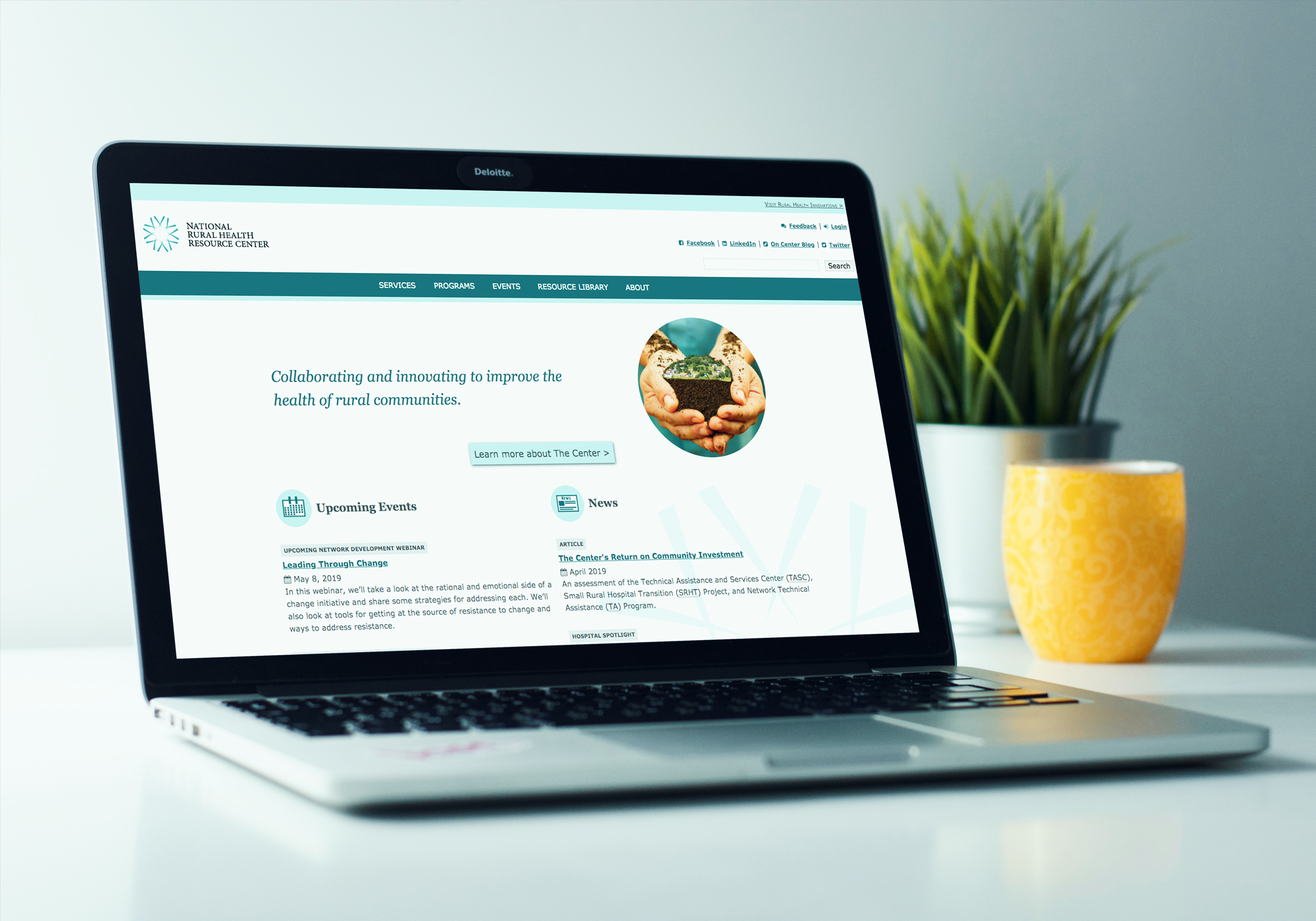
ruralcenter.org User Testing to Validate an Audience-Centric Navigation OnThe National Rural Health Resource Center (The Center) is a nonprofit organization dedicated to sustaining and improving health care in rural communities by providing technical assistance, information, tools, and resources. Users on the Center’s site are looking for information relating to services they provide, programs and events they coordinate, and resources that have been developed to guide and support rural health stakeholders, like webinars, articles, and presentations.
The Center had been making iterative modifications to their Drupal site to improve wayfinding for their visitors, but the team had not yet been able to conduct any user testing on the organization of the site. The Center partnered with Palantir.net to build on previous architecture work and test, validate, and provide recommendations for a more effective, user-centric navigation that lowers user effort on their site.
The goals of the engagement were to:
- Make navigation labels and structure relevant and intuitive to users
- Test and validate hypotheses with real user data
- Have the web team partner hands-on with Palantir, so they could see how the user testing processes and tools work and execute these research methods on their own for future optimization efforts
The project had two key constraints:
- Testing needed to focus on copy and labeling rather than new features. The Center’s goal was to surface UX improvements that their team could implement within the Drupal CMS by iterating on menu labels, menu structure, and copy.
- Limited budget. The Center’s budget could cover a limited set of tests, so Palantir needed to formulate a testing plan that maximized the value of the user testing.
Palantir and the Center teamed up to run a Top Task survey to inform a new Information Architecture (IA) and then ran a tree test to validate the new IA.
Key results with the new Information Architecture and the optimized tree:
- 17% higher success rate overall for users completing tasks
- 8% increase in overall “directness” rate (tasks completed with fewer backtracks)
How did we get there?
Palantir implemented a three-step process:
- Work with key stakeholders at the Center to identify key metrics.
- Design and implement tests.
- Handoff our recommendations for the Center to implement.
Step 1: Work with key stakeholders at the Center to identify key metrics.
It was imperative to understand the Center’s goals as they relate to their user’s goals to be able to optimize the site structure and test against what users find important.
Because the Center’s site is a resource site first, the goals focused on users being able to find the resources they are looking for.
Key Performance Indicators (KPIs)
How we planned to measure success against our established goals:
- Customer-reported satisfaction with “findability”
- “Did this content answer your question?” feature (example)
- Improvement in task performance indicators
- Webinar participation
- Completion of Self-Assessment form
- Download of publications
- Qualified, interested service leads
Step 2: Design and implement tests.
Our testing approach was two-fold, with one underlying question to answer: what is the most intuitive site structure for users?
Test #1: Top Task survey
During the Top Task survey, we had users rank a list of tasks we think they are trying to complete on the site, so that we have visibility into their priorities. The results from this survey informed a revised version of the navigation labels and structure, which we then tested in the following tree test. The survey was conducted via Google forms with existing Center audiences, aiming for 75+ completions.
We then used these audience-defined “top tasks” to inform the new information architecture, which we tested in our second test.
Test #2: IA tree test
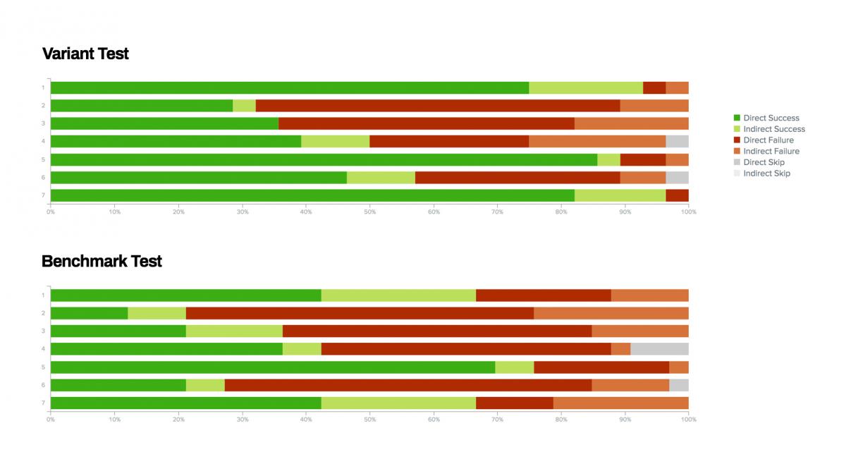
During the tree testing of the Information Architecture, we stripped out any visuals and tested the outline of the menu structure. We began with a mailing list of about 2,500 people, split the list into two segments, and A/B tested the new proposed structure (Variant) vs. the current structure (Benchmark). Both trees were tested with the same tasks but using different labels and structure to see with which tree people could complete the tasks quicker and more successfully.
Step 3: Handoff our recommendations for the Center to implement.
Once the tests were completed, users’ behavior was compared to an “ideal” path, and success rates were analyzed. The test results informed our recommendations to help the Center think about label changes that are more user-centric as opposed to internal jargon.
The Center has worked with Palantir on multiple projects. Palantir delivers their service in close partnership with our small team. This approach has allowed us to build our internal website development capacity and repeat success even after Palantir’s contract work was completed.

The Outcomes
Overall, users had a 17% higher success rate with the optimized tree, and they completed the tasks with fewer “backtracks” (less second-guessing their path) on the variant.
One of the most impressive results for the Center was that 29% more users could find recorded webinars with the newly proposed tree.
Next steps for the Center will be to implement the top-level navigation recommendations made by Palantir, and then select KPIs to monitor long-term. They’ll also follow up with program-specific tree test projects.
The greatest mark of success for this project is that the Center’s web team now has knowledge of the tools and processes needed to run these tests on their own, so they can continue to make iterative improvements over time. Websites are one of the most important tools used to deliver business value, and just like your business’ needs evolve over time, so do the needs of your audience. It’s never too late to perform user testing and improve upon your user experience.
