 Simplifying the complexities of access to family healthcare On
 Our client is one of the largest children’s hospitals in the country. With a medical staff of nearly 1,000 pediatric specialists, this hospital provides world-class inpatient, outpatient, trauma, emergency and urgent care allowing for the most comprehensive pediatric services available in their state. This healthcare delivery system and network provides health services across more than 75 pediatric specialties and is poised for continued growth in quality patient care, research and medical education.
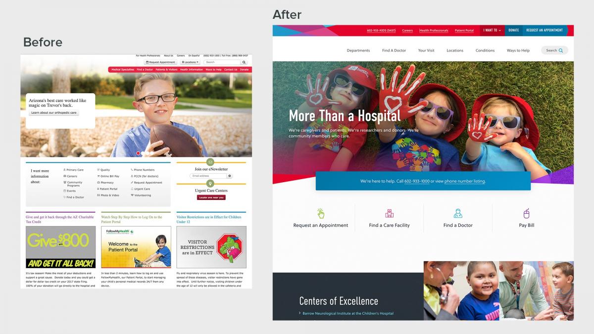
The hospital’s former website was extremely information-dense with thousands of pages of mostly text-based content and complex and somewhat non-intuitive navigation. Important information was buried deep in the site. The search functionality needed to be improved to sort, filter, and categorize critical results. Additionally, there were many practice sites and microsites that had been developed by different hospital departments over time that needed to be brought back under a unified architecture.
The Vision
The vision for this redesign project was clear: to simplify the complex pediatric medical care process by providing families and people in need with clear and concise information about the hospital’s health care services.
Palantir planned our approach based on the following goals:
- Increase engagement via an improved patient experience.
- Reinforce the hospital’s credibility and their national reputation for excellence in specialty care.
- Provide trustworthy health information within a convenient environment.
- Provide educational materials for anyone needing to learn about a disease or diagnosis.
- Improve content management efficiency.

Frictionless Access to Healthcare
A key objective of this site is to help visitors easily get access to care for their families. All types of content on the site should have strong calls to action for a visitor to request an appointment or make other decisions that could lead to them getting the care they or their family need. Less friction in the process allows for a larger number of people to choose the hospital for treatment.
Our client was able to optimize the content on their site and take the site from 10,000 pages down to 900 pages. Paired with their new increased search functionality, site visitors in need of finding critical healthcare information can now do so more quickly and with greater ease.
The redesign has led to increased conversion for:
- Online Appointment Form Submission Requests
- Patient Referrals
- The Find A Doctor Journey
- Usage of the Patient Portal
- Subscriptions to Newsletters
The Palantir Approach
All of the overall goals for our client’s redesign tied back to one thing: optimizing their content and navigation. This project was broken out into two phases to address content strategy and modeling first that could then set the path for the design and build phase.
Phase 1: Strategic Focus, Content Audit, and Content Modeling
An important part of the strategy phase was to complete a massive site audit in partnership with another agency who helped out with copywriting. The old site had over 10,000 pages and many of those pages had low engagement. The overall plan was to analyze our client’s existing content and remove any content that site users weren’t looking for or finding relevant.
The first phase took about 10 weeks and resulted in a content model for key page types. Each page type included an evaluation of the content on the site as it was, as well as strategic recommendations for how the page type would be used in the future. Four of these page types were then wireframed. By building out content types directly in their content management system, Drupal (as opposed to organizing content in a spreadsheet), the client team was able to see how their content would be displayed.
Phase 2: UX, Design, and Build
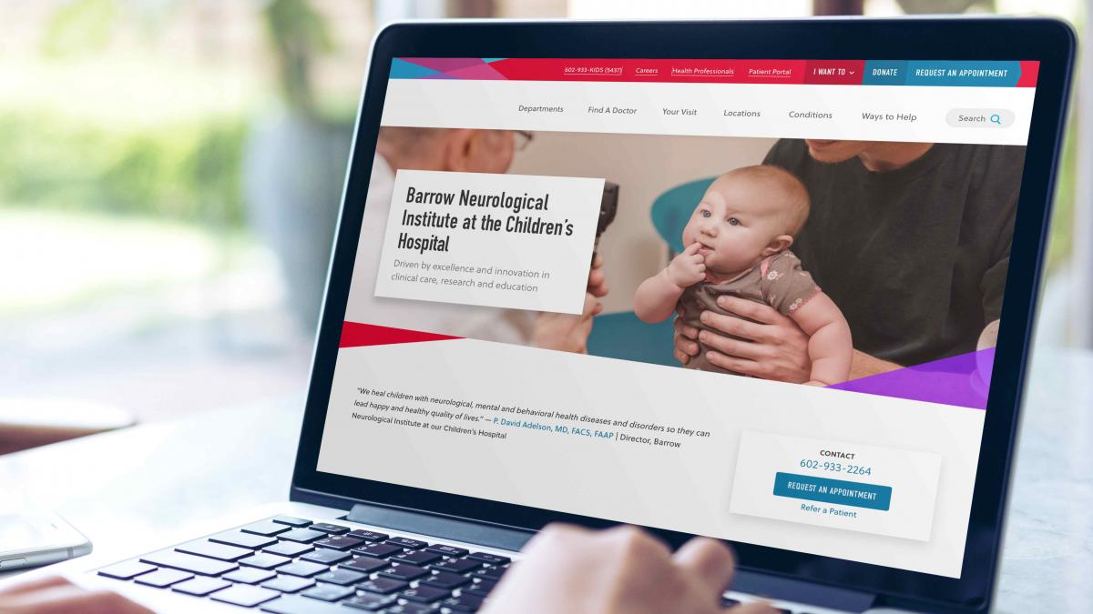
As soon as the first phase was complete, the second phase began with solidifying the content model, creating and implementing a design system, as well as building and launching the site.
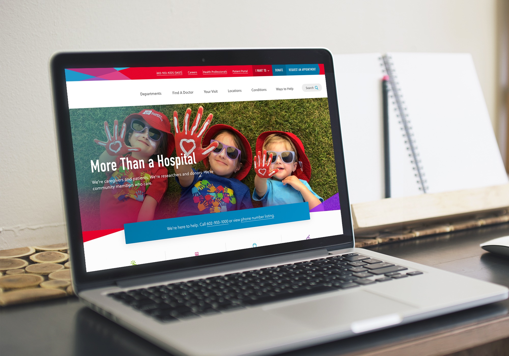
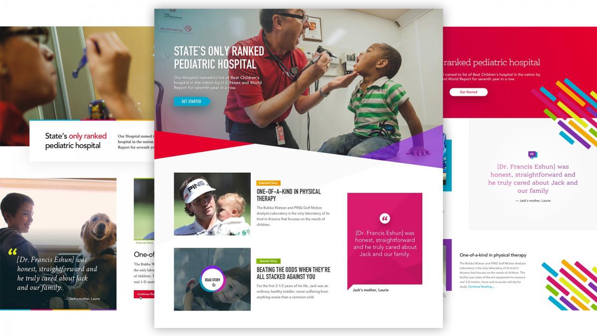
Our goal was to design a solution that showcases the cutting-edge research and innovation at the hospital. We did this with the use of modern design treatments that takes a visual spin on words with dynamic shapes, creating a captivating first impression, and setting them apart from their competition.

The look and feel captures the vibrant and playful spirit of the hospital with an energetic and uplifting color palette that creates a sense of hope for patients and families and elevates our client’s online brand presence. The use of authentic, non-stock imagery communicates a warm and caring environment that is paramount to their mission of providing the best possible care for patients and their loved ones.
The design components are simple and clean but unique in composition and layout. Though there are bold colors and images, the information is communicated in a clear and concise way which allows users to take action along their intended journey. The use of subtle interactions highlights content that educates and instructs, driving more patient engagement.
Find a Doctor
Researching and finding the right doctor to see or treat your child is a crucial step in ensuring good care for your child. Our client wanted to make its database of physicians available for the public to search and aggregate physician information with ratings and other key pieces of information to help empower patients and parents.
Palantir built a framework for merging in complex data from multiple sources in Drupal to provide an intuitive, sleek search interface that allows users to sift through huge quantities of data to find exactly what they’re looking for. By pulling key pieces of information in from externally-managed systems, we were able to lower the workload on the marketing team necessary to keep the physician directory up to date and accurate as physicians, credentials, insurance, and location information change over time.
Search Strategy
Palantir defined personas for the various site audiences. The site needed to be able to surface relevant content for teens, parents, physicians, and people in crisis situations. We tested wireframes in-depth and performed chalkmark tests around the menu structure, both of which helped make sure pathways were simple and straightforward for all audiences.
For general site search, we implemented Solr-based Acquia Search, which provided more advanced capabilities than the standard Drupal search functionality. Palantir added recommended results, so if there is something our client wants to bump to the top of search results based on a specific keyword, they now have that ability. For example, if a user were to search for the term “cancer,” our client can now make sure that results for the oncology department get bumped to the top of the results list.

Connection and Conversion
Our client is passionate about connecting its collaborative network of providers to patients and parents who are just as eager to find the right kind of care. Through this network, they are able to achieve their mission. Their new digital presence will allow them to iterate and expand on the ways they are able to meet the needs of their community for years to come.
Major Outcomes
- An increase in awareness and conversion through “Find a Provider” flows.
- Users can make effective choices as they weigh convenience, cost, and quality by displaying available appointment times, making pricing transparent, and using geolocation to surface nearby facilities.
- New or returning patients can easily request an appointment by surfacing contextual calls to action and enabling system-wide scheduling.
- Simple forms eliminate existing pain points, minimizing the amount of information initially required as input.
- Robust provider profiles inspire confidence and trust. When available, we included personal statements, videos, ratings, and testimonials that appeal to customers’ emotions and values.
