How Loyola Medicine is helping patients get the information they need about COVID-19 vaccines
As we move into the vaccination phase of the COVID-19 pandemic, health systems are facing a new challenge: effectively communicating about vaccine availability, eligibility, and scheduling. For many systems their website is the primary - and sometimes only - channel of communication about vaccination.
This is a content strategy challenge: how should we structure the patient journey to prioritize quick answers to top patient concerns while enabling visitors to drill down to get more information at any point?
We just teamed up with Loyola Medicine to update their COVID-19 pages, and in this post we’ll walk you through the before and after.
Before

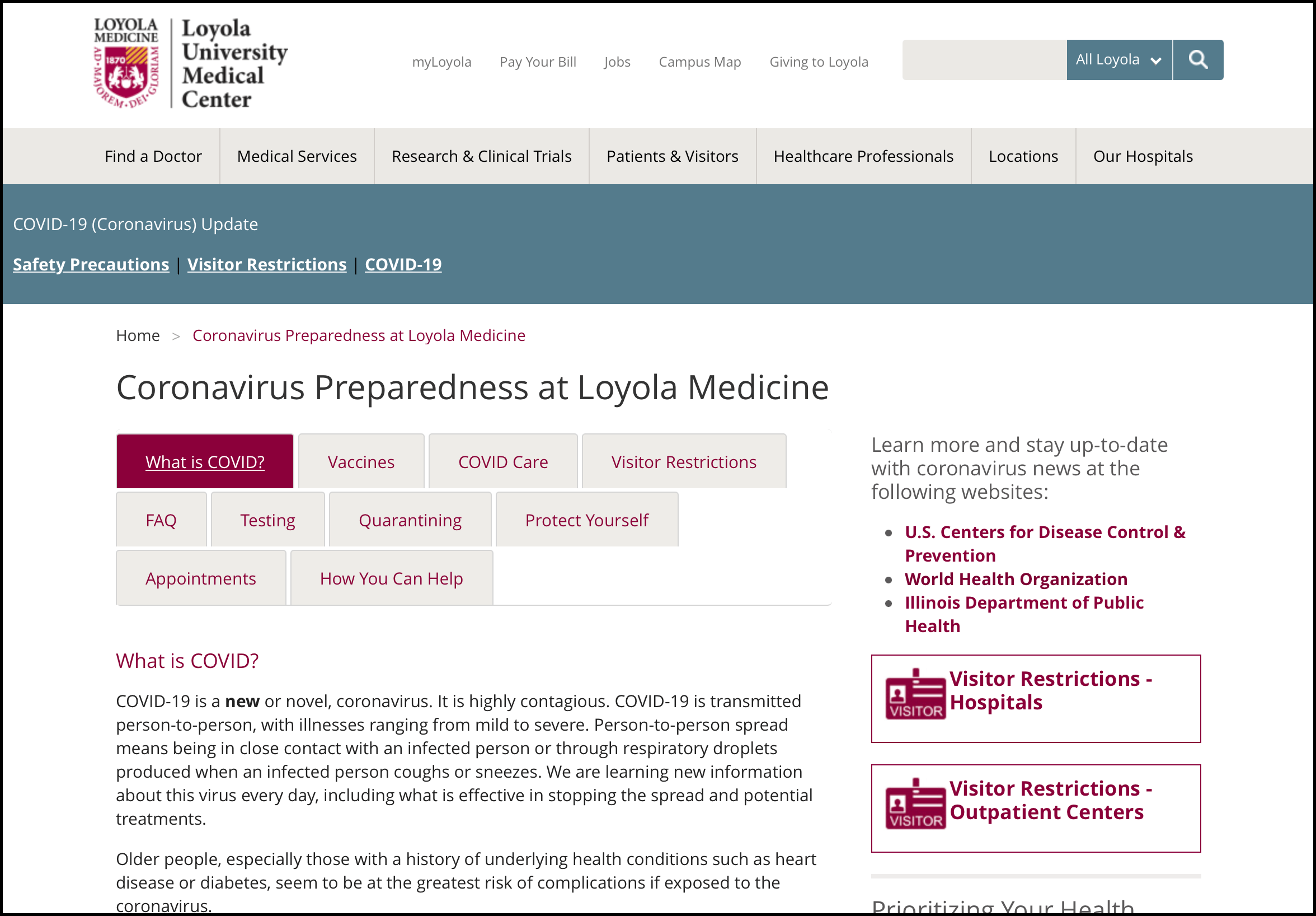
At the start of the pandemic people had a flurry of questions: What is COVID-19, what are the risks, what are the symptoms, how can I protect myself, when should I seek medical help, how do I get tested, what does this mean for patients who need non-Covid medical care?
Loyola’s original COVID-19 page shows a patient journey focused on demonstrating immediately that Loyola can answer all of those questions. The tabbed interface at the top of the page helps visitors quickly find and click on the tab that matches their need.
After

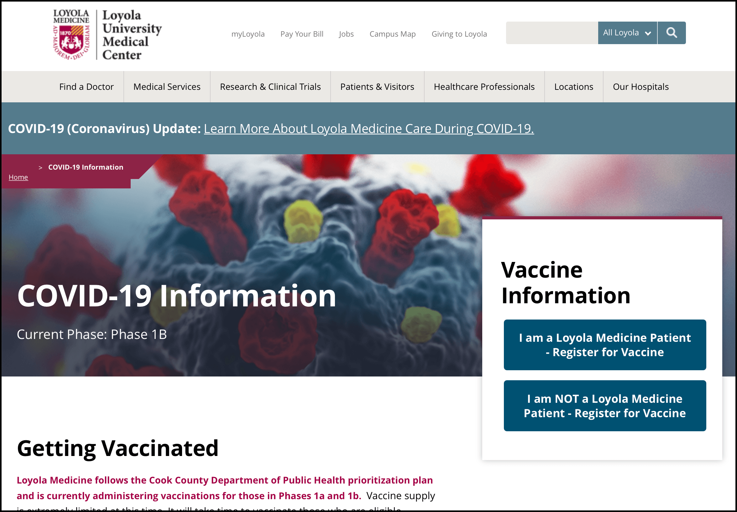
Right now, the question that is driving the majority of patient inquiries about COVID-19 is: how do I get the vaccine? This is a much more task-oriented goal than the early need for accurate information, which means that the patient journey can be radically reshaped to prioritize vaccine scheduling steps and streamline the rest of the content.
The new Loyola COVID-19 landing page leads with the primary call to action question: Are you an active Loyola patient or not? Visitors who are active Loyola patients are directed to MyChart to register, visitors who are not active Loyola patients are directed to registration through the city/county/state.
By making the first patient “doorway” a path to vaccine registration, Loyola is addressing the top priority of the majority of their visitors. However, some visitors are still looking for other COVID-19 information, and that content hasn’t gone away - it’s simply been deprioritized. A visitor scrolling down the page can still quickly and easily find clear, bold links to more detailed information about symptoms, prevention, Loyola’s safety precautions, vaccine safety, and how to care for someone who is ill.
How We Did It
Creating and publishing this new page took five business days as a routine part of the ongoing strategic services and managed support we provide to the Loyola team. There was no need to spin up a new project or team because we were leveraging their existing Drupal 8 platform and design system.
This page was built using a content type designed to enable Loyola Medicine to reorganize their page-level content strategy as priorities change. This template is a flexible landing page: it has a hero image, space for body copy, and then a big field that you can use to mix and match a wide range of visual components.
With this template the Loyola Medicine team can build pages that look really different and deliver against different page-level content strategies without having to route new page development through Palantir or other support vendors. In this case, they brought us on to speed the new page along, but going forward they can adjust it themselves.
Extensible platforms like the ones we’ve built for Loyola Medicine, HonorHealth, and Baptist Health South Florida enable marketing teams to optimize their patient journey as the realities on the ground change.
Photo by Ivan Diaz on Unsplash
Design Drupal