The world is going mobile at a very fast pace. Smartphones, tablets, laptops have been the new luxury for the current generation. People want to have easy access to everything. The technology updates happening daily have made it possible for people to go beyond communication on mobile phones. Accessing the website on cell phones may create a confusion loop for the people as many times these websites are not upgraded to behave responsively.
With a large number of the population using mobile phones, businesses are focusing on providing the best mobile interface experiences to their users. Drupal has acquired a large technology market. It is not only good for building websites but is also considered as an efficient tool to provide an impressive and powerful mobile experience to its users.
Let’s take the plunge and enter the world of mobile solutions powered by Drupal.
Every organization has its own specific courses of action to address the increasing needs of the application development process. It usually varies as per the requirements and resource availability, like, some are engaged in the development of responsive web-based applications and others have expertise in delivering full-fledged native applications to be deployed into the mobile devices.
Whether it is about incorporating themes, multi-language distribution, web-based mobile apps, cross-platform integration with third-party tools, Drupal is giving a lot many choices to the developers to define mobile solutions and their integration into an overall content and application infrastructure. The next few sections describe the types of mobile solutions offered by Drupal.
Mobile-First Approach for a Great Web Experience
Mobile-first, the philosophy created by Luke Wroblewski, is an approach of displaying web pages on different devices irrespective of the distinct window screens or sizes. That means the two concepts that are vital for a mobile-first design are-
Responsive Web Design (RWD): A web design method that automatically renders a web page according to the display screen of a user creating a soothing transition for the user.
Progressive Enhancement and Graceful Degradation: In order to display a web page reasonably on different devices, customized versions of the product are designed for different ends. The terms progressive enhancement and graceful degradation are completely different from each other but are always used in conjunction.
- Progressive Enhancement: In progressive enhancement, basic functionalities, and features are implemented first on the lower browser versions (mobile phones). Later, complex interactions or functionalities are added on the basic version, upgrading it for the advanced browser versions (tablet, PC).
- Graceful Degradation: The designing of the product is started from the most advanced version(desktop, laptop) with the implementation of complete functions and features. Later, when making the version compatible with mobile versions, the removal of some of the features or content is done.
In between progressive enhancement and graceful degradation, progressive enhancement is the most chosen approach for the application design process. Drupal supports the building of responsive websites and web apps, offering a consistent content experience to its users irrespective of the device size in which the application is being displayed.
Though the mobile-first development requires an effort, it promises easier deployment and high scalability. Numerous big brands are choosing Drupal over other technologies and are excelling ahead in their approach for mobile application development.
Below are listed examples of two organizations who have benefitted from Drupal’s mobile-first offering:
The Men’s Health Magazine Chronicle

The multinational and constantly evolving brand in the men’s grooming industry, Men’s Health Magazine, intended to develop a thorough content-based platform coupling a better digital experience for its mobile users. With Drupal, the website was optimized for all screen sizes ranging from large desktops to small-sized handheld devices.
Complete Case Study on Men’s Health Magazine can be read here.
The YardStick Saga
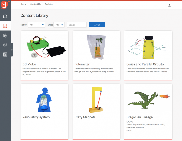
Yardstick, being a global leader in offering modern digital solutions over traditional learning for students, chose Drupal to provide easy and simplified access of the application to different users on distinct device screens.
Complete Case Study on Yardstick LMS can be read here.
Drupal is not only a way to build efficient web applications, but it can also be used as a backend for compelling mobile application development. In the following sections, we will explore the native, hybrid and progressive mobile solutions delivered by Drupal. The native mobile application first.
Scale Content Experience with Native Mobile Applications
Furnishing content through a native mobile application is all about managing the content and application-level services with Drupal. In addition to that, the application is allowed to use the capabilities of the device in which it has been installed. The front-end user experience, input events, and context are handled by the mobile application whereas Drupal responds to the events or requests made, providing the content from a shared source. A service module connects the app and the Drupal.
The best part about the native mobile applications is that these can be accessed without an internet connection. Considering the device platform diverseness, native app development with Drupal is described ahead.
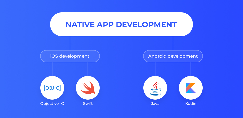
The platform-specific application that runs on iOS is usually written in Objective C or Swift. The development is done in Mac that is compatible to run Apple's XCode IDE. Java or Kotlin are used to write an android native application. Connection of Drupal site running the services module is done with one of the two following HTTP libraries:
- AFNetworking is a networking framework for iOS, macOS, watchOS, and tvOS.
- ASIHTTPRequest is a CFNetwork wrapper for HTTP requests, Objective-C, Mac OS X, and iPhone.
- Alamofire(Swift) is an HTTP networking library written in Swift.
As mentioned before, Drupal is being widely accepted as a backend service for application environments and web services. This has enabled data consumption and manipulation in many distinct ways.
For example, Waterwheel Swift, formerly known as Drupal iOS SDK (software development kit), facilitates Drupal as a backend service for iOS, macOS, tvOS, or watchOS. It integrates most of the Drupal API features (session management, basic auth, entity crud, local caching, login view controller, etc.) in one SDK.
Caching strategies, use of asynchronous methods for data downloading and refreshing after each download completion, pre-fetching data on application load, and network timeout issue management are the things that should be taken care of while developing a native RESTful iOS app.
Appcelerator Titanium, an open-source framework, developed by Appcelerator, is another example that facilitates native mobile application development for multiple mobile operating systems with a single JavaScript codebase.
Also, PhoneGap, first named as Apache Cordova, is a software development framework from Adobe systems (originally produced by Nitobi Software). It is open-source and is used for cross-platform mobile application development. It facilitates development using HTML, JavaScript, and CSS. DrupalGap, an application development kit for the drupal websites is one of the projects of PhoneGap created using PhoneGap and jQuery mobile.
Leveraging Native and Web’s best in Hybrid Mobile Applications
While going for hybrid mobile applications, the best of native and web applications are chosen and integrated together. Usually, HTML, CSS, and JavaScript are used in hybrids to offer a native web view (UIWebView in iOS or WebView in Android). These apps run on multiple platforms (Android, iOS) and are easily distributed through App stores. In addition to that, hybrid apps can access many device resources such as camera, contacts, accelerometer, etc.
Ionic is the most widely used HTML5 framework for the development of a hybrid application. Based on AngularJS, Ionic extends the capacity of developers to build cross-platform applications from open source to premium and also enabling easy deployments of the application.
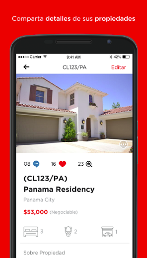
Clasifika, a multi-platform real estate hybrid application, has been developed using Ionic and Drupal 8 as the backend. The successful integration of design thinking with the real world, keeping the performance and UX design optimized.
Delivering App like Experience with Progressive Web Applications
The term progressive web app (PWA) was conceived by Alex Russel and Frances Berriman. PWA is developed using modern web APIs along with traditional progressive enhancement strategy to create cross-platform web applications offering app-like experiences on desktop and mobile. Pinterest is one such progressive web app that helps users to curate images, videos, etc. from a list of choices.
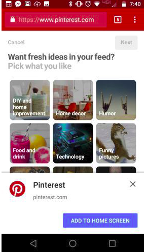
Most of the time while visiting a web page, you must have come across the button ‘Add to Home Screen’. When clicked, it gets installed in the background and can be accessed from the application pack after the successful download. The best part of a progressive web app is that it is available as a basic native application on the phone and can work offline too. Also, PWA (Progressive Web Application) loads fast and creates an engaging experience for its users.
Integration with a Progressive Web App Module supports the straightforward initiation of the Drupal-based progressive web app. With its extensible platform services and content-centric infrastructure, Drupal is an ideal choice for delivering reliable and engaging mobile experiences to the users.
Final Note
The future is definitely bright for mobile devices. As the digital world is evolving, a large mass of people are choosing mobile devices over computers. Convenience being the essence. Drupal is not only the best choice for building web applications but is also a reliable platform for effective and compelling mobile applications development.
The world is going Drupal and so are we. We at OpenSense Labs are engaged in offering better digital experiences to our clients with our expertise in Drupal Development.
Drupal has unfolded many major benefits for the developers. How do you see it from your viewpoint? Share your views on our social media channels: Facebook, LinkedIn, and Twitter. You can also reach out at hello@opensenselabs.com.
