
In this increasingly growing digital age, people are using the internet for education, business, and whatnot. The internet is filled with opportunities to read and learn online and start something new. Websites and apps provide personalized experiences to their users to make them feel special and create a bond with the brand.
The only thing that we sometimes forget to consider is that there are people out there who face challenges, or, in other words, are showing cognitive disability. Such situations push people towards losing their understanding of a lot of things that include even being unable to read or write.
People with cognitive differences have far more difficulty in doing a mental task when compared to an average person. When surfing online, accessibility for people with cognitive disabilities is a major concern. A lot of the content is very difficult to understand for such an audience. There are a lot of things that the designers can do to improve the cognitive accessibility in web design.
Before we get to what needs to be done, let’s understand some important kinds of cognitive disabilities.
Cognitive disabilities and skills
While designing a web page, people mostly consider designing something accessible to blind people. But we need to understand that there is a lot more than that. Cognitive psychology is something that we, most often than not, don’t take cognisance of.
Cognitive disabilities can be classified in two ways: functional disabilities and clinical disabilities. Clinical disabilities include dementia, severe brain injuries, autism, dyslexia, and down’s syndrome. This classification of cognitive disabilities is useful for the treatment process, which makes the functional classification of cognitive disabilities more useful, in terms of web accessibility. Functional disabilities include anxiety, depression, inattention, reading issues, etc. Let’s have a look at some of them:
Anxiety
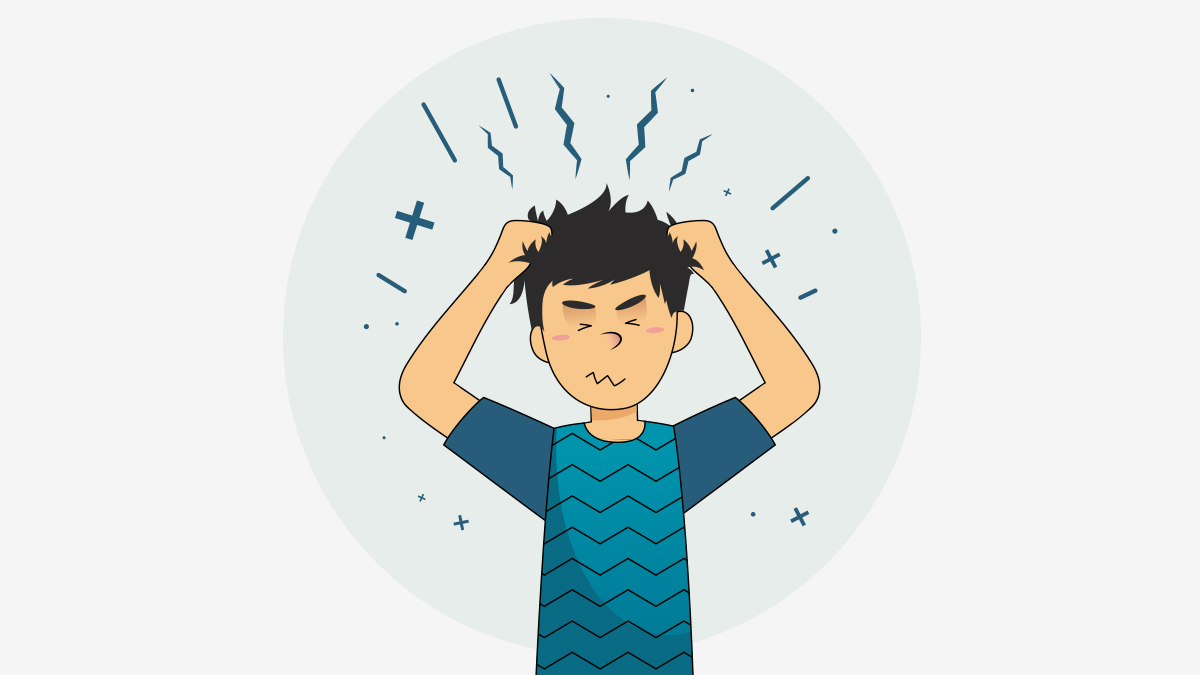
None of us realize this, but there are a lot of people who suffer from anxiety around us. Anxiety can be a feeling of worry from something that happened at the office, or home or even before taking a test or a difficult decision. But anxiety disorders are more than the temporary worry of fear. They do not go away easily and worsen over time. According to a report, 19.1% of adults suffer from anxiety disorders.
Users with anxiety disorders might get worried if they are going on the right way and doing the right thing when they visit your website. You need to make their experience a good one by reassuring them that it is ok if they do something wrong. This will help in reducing stress and the users won’t leave the website in the middle.
Inattention
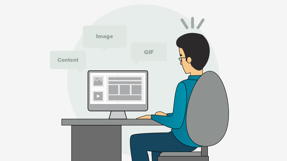
Attention Deficit Hyperactive Disorder (ADHD) is a common disorder in children and can continue to adolescence and adulthood. Reports say that 4.4% of adults suffer from ADHD. This disorder makes it difficult for a person to pay attention to anything.
If there is too much design on a page, the person will not be able to focus on what he needs to focus on. For example, if a user suffering from inattention opens a webpage to read an article, and finds a lot of videos and images around it, it will be difficult for people to focus and read the article. Thus, minimizing distractions around the content is a good option. The second thing you can do is give an option for switching these elements off if the user doesn’t like them.
Depression

Depression has become very common among young adults and is a major disorder. Around 6.7% of adults are the victims of depression. For such people, any day can be a bad day.
We don’t think about people with depression while designing. There are a lot of things that we need to keep in mind, like not letting the users checkout as a guest or asking the user to sign up to view your content. Users with depression will not even look at your content if you make such mistakes.
Memory loss
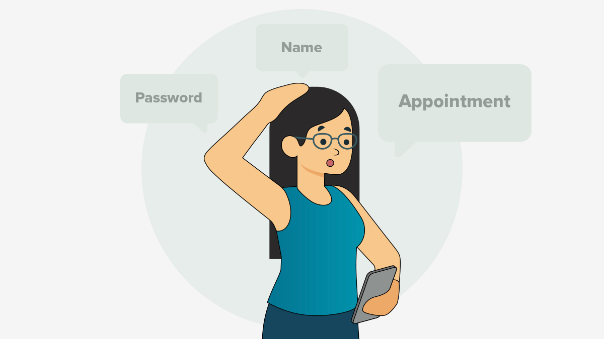
There are three types of memory disorders: Immediate, Short term, and Long term. Some people suffer with either one or even all the three at once. According to the World Health Organization, 50 million people have dementia world wide.
People with memory disorders even forget why they landed on a particular page in the first place. If a particular web page shows a lot of messages and pop-ups at the same time or simultaneously, the user will end up forgetting all of them. In such cases, you should make sure you do not load the user with too many messages at once.
Reading disorders
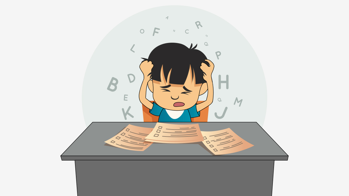
Dyslexia is a reading disorder where people have difficulty understanding the text. In severe cases, people lose the ability to read. According to the Dyslexia centre of Utah, 70-80% of people with poor reading skills are likely dyslexic. Designers must keep in mind to keep their content and design as simple as possible for the people with such disabilities and make sure that it is understandable by them.
Problem-solving disorders

People who suffer from problem-solving disorders find themselves getting frustrated easily and this leads to the user leaving the page. For example, a broken link on the page would lead them to nowhere and will not get them what they are trying to find and this will lead to frustration.
Visual comprehensive disorders
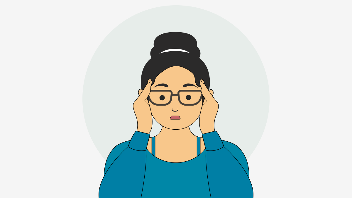
People with a visual comprehensive disorder face difficulty in interpreting visual information. According to the Advanced Vision Therapy Centre, 25% of all children in the US have a vision problem that affects learning. They have a hard time telling the difference between two objects that look similar. Such people also have language-based learning disabilities.
Web design considerations for improving cognitive accessibility
It is important to have an understanding of the cognitive disabilities to make technology accessible for people with disabilities. To enhance the web experience for people with cognitive disabilities, you need to consider the following design tips:
Consistent Navigation

The users should be able to navigate and find content easily when they visit your webpage. The first thing that the user observes is the page title. The title should be about the content and the users should be able to understand what your content is talking about by having a look at it. Make sure that the headings and the subheadings are clear.
People who are slow readers or have a short term memory problem can get a clear understanding of what the content under a heading will be. So we need to make sure that our content is findable and the website is navigable.
People do not like to go from page to page to find what they are looking for. So making the content easily accessible for the users by giving a search function, or creating a content table or a site map. All your content should be in order. People with inattention and slow motor issues find the problem in focusing if the content is not in a particular order.
Allow users time
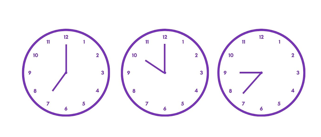
People with cognitive disabilities require more time to read content and thus giving them a limited time to buy a particular product might freak them out. Also, getting logged out after a particular amount of time, say 30 minutes also drives users away.
The users should be able to adjust the time that is allowed for a login session. An alert should be sent to the users 20-30 seconds before the session times out and they should be able to pause it for a particular amount of time by the simple press of a button.
Write clear content

Long and ambiguous phrases should be avoided and simple short and unambiguous phrases should be used. People with cognitive disabilities find problems in reading complex sentences. Try to avoid non-literal content such as metaphors or sarcasm. The content should be readable and understandable. If a particular phrase is used to define one or more things, explain each use.
If using abbreviations, make sure you define them because people with limited memory and difficulty in decoding words will easily get confused by them. Your content should be easily adaptable and presented in different ways without letting it lose its meaning and structure. To know more, read these tips on publishing accessible content.
Use supplemental formats

People have difficulty understanding words and sentences. In such cases, we must try to present our message with the help of images and videos or gifs as much as possible. But this does not mean that you will fill your page with such a format. Make sure that the images or the videos are minimal and can give the users the required information.
Web pages should appear in predictable ways
The navigation, as we discussed, should be easier for the user. In the case of people with cognitive disabilities, consistency in the website is important. Any kind of change in context can lead to confusion among the users. Hence, the users should be allowed to activate a feature to change context. Alternative text for icons and images, icons with text consistency in button labels are a great help to all your users.
Help users in avoiding and correcting mistakes

We all make mistakes and move on. But people with cognitive disabilities make mistakes, get terrified by making mistakes, and take a lot of time in correcting them.
If there is an error from the users’ end, send a clear message that notifies them of the error as specifically as possible. Some people might have difficulty in understanding the text version, for such people include colors and icons that relate to your message.
Include spell checking, text, and link suggestions to the users while they sign up or fill a form. Providing an example if a particular data format is required, will help the user input text easily and without making any errors.
Check out this ultimate guide on how to plan for accessibility in web development.
Conclusion
There is still a need for cognitive disabilities to be talked about. Little things affect both your users and you. Considering all these tips mentioned above, try to involve as much of them as possible while designing a web page to provide an unforgettable experience and a different kind of bond with your users. Send us an email at hello@opensenselabs.com for taking your brand to the next level!


