

Mediacurrent created the Rain Install Profile to build fast, consistent Drupal websites and improve the editorial experience. Rain expedites website creation, configuration, and deployment.
In the last developer tutorial, we covered how to customize and develop Drupal sites using Rain’s base install profile. This week, we will dive into theming to help frontend developers update the look and feel of the Rain starter theme.
As usual, if you have a question or comment feel free to reach out at @drupalninja
Sub-theme or clone?
The first thing to note is that you can use the Rain install profile with or without the included Rain theme package. The “rain_theme” project exists as its own Composer project which is included by default but can be easily removed. That said, there are benefits to using the Rain Theme as a base theme or starter. The primary benefit is that Paragraphs are integrated with a dozen or so pre-built components that can be easily customized and save you time.
If you do choose to leverage the base theme, you need to decide whether or not to use Rain Theme as a “parent theme” or as a starter. We highly recommend you do not. This way, you gain full control over the theme and do not need to worry about downstream updates. Leveraging Rain theme as a parent theme can cut down initially on files and code but parent themes in Drupal can be restrictive and cumbersome at times. Ultimately, the decision is yours. With the “clone” approach you can grab everything and rename it or grab only what you want. Anything you don’t use can be discarded.
Using the style guide
The Rain Theme project includes a KSS-based living style guide that has a host of pre-built Twig components that can be integrated with Drupal theme templates.
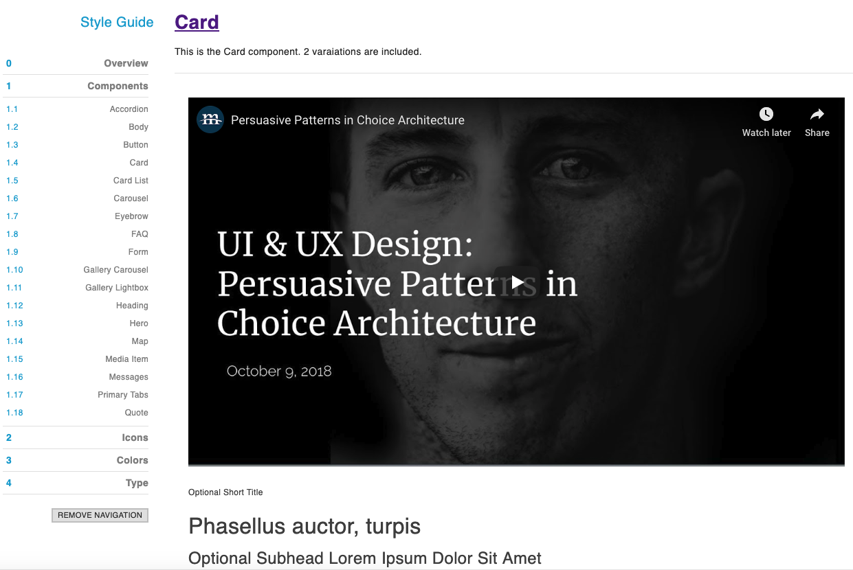
KSS style guide Example
In the previous step, we mentioned that we recommend cloning the theme so that you can fully control and customize any of these components. The idea is that developers waste less time rebuilding and re-styling the same common components on every new build. Instead, Drupal themers get a head-start while still having enough control of the theme to meet the design requirements of the project.
Working with the popular KSS node project is straightforward. For more information on how to compile and develop with KSS node, visit the project page at https://github.com/kss-node/kss-node.
Even if you are new to KSS, you will find making updates is easy. The “npm run build” command will compile all of your theme assets, as well as the style guide.
Component Integration
The main way components are integrated into Drupal templates is through includes found in Paragraph templates.
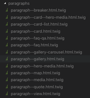
Rain Theme Paragraphs Twig templates screenshot
Using the Components module to define the “@components” namespace, you can see an example below where field markup is passed in as parameters to the component Twig file. You will also that it’s in these templates where we typically attach a library (more on that in a bit). Of course, this is all ready to customize and any time you add or modify fields you will need to adjust templates or components accordingly. JavaScript and CSS are for the most part encapsulated in their corresponding component which keeps things organized. We do recommend you enable the “Twig debug” option in your Drupal services.yml to make it easy to find which templates are being used on any given page.
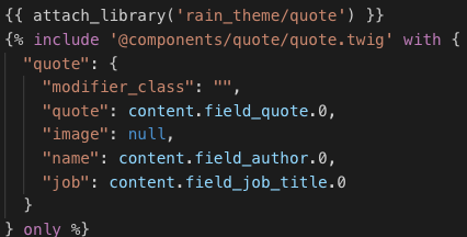
Rain Theme Quote Paragraph template
Libraries
Out of the box, we have included many libraries that style components and include vendor libraries where appropriate. Note that these libraries reference compiled CSS and JavaScript found in the “dist” folder of the theme.

Rain Theme Libraries screenshot
Additional Theming Helpers
In addition to the pre-configured templates, style guide and libraries included with Rain, we also ship a few helper modules to make theming easier.
The “Twig Field Value” module makes it simpler to pull out values from fields and the “Twig Tweak” module adds several utility methods. For a full list of those functions with information visit the “Cheatsheet” documentation page on Drupal.org. As mentioned earlier, the “Components” module is also included and enabled by default in order to allow namespaces to be defined in our theme.
Wrap-up
In this article, we showed frontend developers how to leverage the Rain base theme and style guide. Our recommendation is to clone the theme folder and customize our pre-built components to match your project’s unique requirements. We also covered how to integrate Drupal theme templates with components and define custom libraries. Finally, we covered a few helpful theming modules that ship with Rain and save development time.
In the next (and final) Rain tutorial, we will wrap up this series with a focus on content creation for authors.
Was this information helpful? Let us know! https://twitter.com/drupalninja/