One can't utter the words web accessibility without mentioning the WCAG guidelines. They are a great resource, but trying to interpret them to make your website accessible can be intimidating. Fortunately, there are some great accessibility testing tools, such as WAVE, that can point out the problems. Great! Except when you try to use it and turn on an accessibility testing tool in your browser, you instantly find a sea of red and yellow warnings. If you're as new to this as I am, you may sit there wondering, well what now? What do these all mean and where do I even begin to fix the problems? Fortunately, it can be easier than you think to solve the biggest problems.   

Here's a list of 10 ways to increase web accessibility across the board, before you start wading through all the nitty gritty details:  

1. Logical Headings and Page Structure
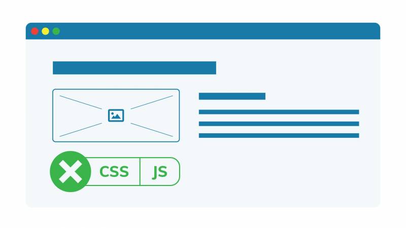
Example of how a page looks without CSS or JS

Well-structured and organized content will make it easier for everyone to navigate your page and take in your content. Both humans and search engines appreciate clear and consistent content. Taking the time to structure your user-interface properly can really pay off, and will be especially appreciated by readers who use assistive technology like a screen reader to access your page. No one wants to sit there guessing what the difference is between your three "Main Menus." The W3 page has some good tips on how to properly structure your page.

If you turn off CSS and Javascript, you can get an idea of how your webpage is read for someone using a screen reader. CSS allows you to position elements wherever you want on the page, regardless of where they are in the code. However, to users using a screen reader, the page won't appear as it does visually but how it is ordered in the code. The same goes for JavaScript. It allows you to manipulate elements by hiding them, removing them or showing them, but the webpage won't appear the same way it does visually to a screen reader.   

2. HTML Semantic Markup and Use of Landmarks plus ARIA  
Semantic structure and navigation with green checkboxes

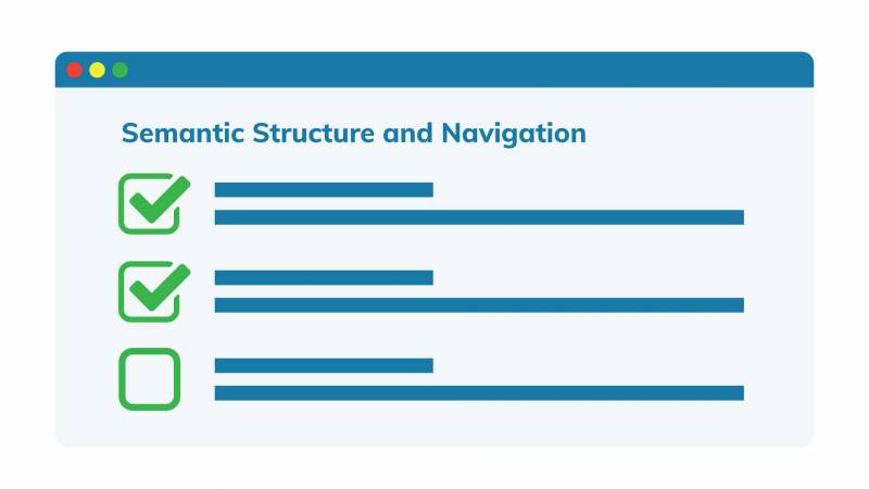
Always use native HTML elements to make the website more accessible when available. You should use HTML5 tags to mark up the main sections of a page (footer, header, navigation, main, etc.), as well as sections, paragraphs and lists. HTML tags can be used to tell a computer about the content of a website and can make navigating using a screen reader much more accessible. This page has a good checklist on HTML elements and attributes for accessibility. When HTML markup is not sufficient, use ARIA markup. ARIA (Accessible Rich Internet Applications) is a set of attributes you can add to HTML elements to make them more accessible for users who use assistive technologies. The first rule of ARIA is don't use ARIA. If there's a way to do it with semantic HTML, that's always a safer bet but if you're not sure how or when to use it, this page does a good job of explaining that.   

3. Headings
h1, h2, h3 headings on a page

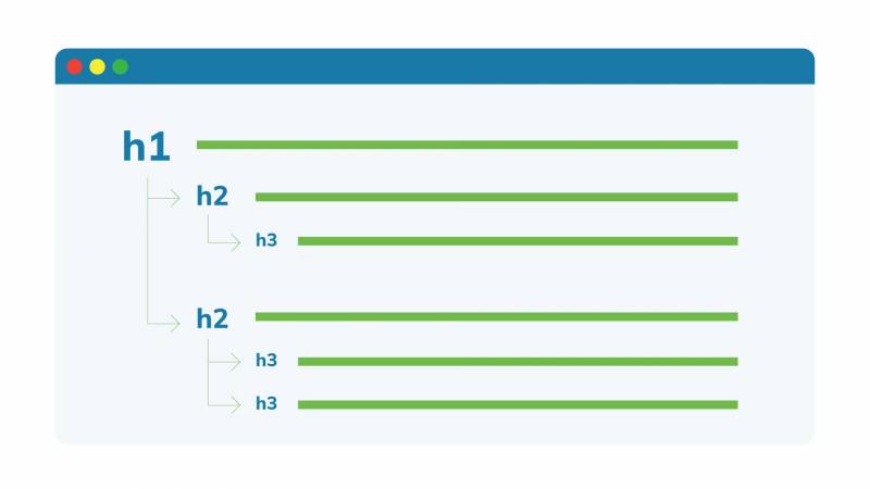
The proper use of headers is another element that goes a long way in helping to structure your page and making it easier to navigate. Headers allow users with screen readers to skip to the section they want. The

element denotes a main heading and there should only be one per page: your page title.

indicates subsections beneath it, and further embedded subsections of that are labelled with

, with

imbedding your content even further, and so on. For more details on how to structure headers, try this blog. Just don't be tempted to skip a layer and add a

beneath an

because users will end up confused. That's like skipping arithmetic and trying to learn algebra after just learning how to count. What happened to

and

and why are there letters in math class all of a sudden?! 

4. Forms

Form fields

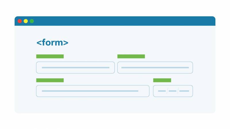
It is essential that forms can be accessed by the keyboard alone for users that cannot use a mouse. Provide overall instructions about filling out the form before the

element since screen readers usually switch to 'Forms' mode when they encounter a form. Each field in the form needs to be properly labelled and the label needs to be in close proximity to the input box for that field. Also make sure any additional instructions are outside the box and not placeholder text inside. For more details on forms, the University of Guelph accessibility page has a good explanation on forms. Basically, when you're building a form, it's one place where you don't want to think outside the box.  

5. Images

Image sample with alt text

Users who rely on a screen reader to access your site need images with alternative (alt) text and there are different types of alt text to use depending on the type of image. If the image is descriptive, such as a young child riding a bike in downtown Boston, the alt text should describe something to the effect of "A young child riding a bike on the streets of downtown Boston." If the image is a functional image which denotes an action, such as magnifying glass to represent a search action, it should indicate the action in the alt text, saying "search." The exception to all this is purely decorative images, which should have an empty alt text. Keep your alt texts snappy. A picture is worth a thousand words, but in this case, 140 characters is usually enough. If you need more clarification on what to write for alt text or how to make them more accessible, then here is a handy guide.   

6. Tables

Table example with HTML tags

Only use tables when absolutely necessary. Do not use tables as part of the layout or to display lists. Misusing tables can make them confusing for screen readers. Use tables to display data with a logical relationship that is best represented in a grid. To make tables more accessible, mark headers with and cells with. Here's more info on accessible tables.  

7. Keyboard Navigation

Person clicking on the tab button

It is important that the site be navigable with a keyboard. Some users cannot use a mouse, and certain assistive technologies do not allow for precise clicking or hovering. Or maybe the user's track-pad just stopped working. To make sure that your website can be navigated using a keyboard, tab through the site using your keyboard. As you tab through the site, check that there is a focus ring  (usually a light blue outline by default) around focusable elements (buttons, links, form inputs, etc.) and that the keyboard focus order matches the visible focus order. Remove any off-screen focusable elements. If you're still not sure how to make your site more keyboard navigation friendly, here is an excellent checklist.   

8. Add a 'Skip to Content' Link

Page with 'skip to main content' button

Another great way to improve site accessibility is to add a 'skip to content' link. When tabbing through a screen to access content, it can quickly become tedious if you have to go through a ton of repeated elements in the header of each page before getting to the main content. A 'skip to content' link provides a keyboard-supported means of bypassing these repeated elements to access the main content, making navigating your page with a keyboard or while using a screen reader much easier. Trust me, if you've ever heard a screen reader reading your mega-menu items every time you land on a page, you'll jump at the chance to let users skip to the good stuff. You can find a bit more about skip-to-content links here

9. Appearance

Page with good spacing between images and text

Certain design elements can also help improve accessibility. Ensure there is enough contrast between the text and the background. Also, choose a sans-serif font for increased legibility, ensure the font is large enough, and enable resizable text. Never underestimate the value of space. Ensure adequate spacing between each line of text and between paragraphs. We've written a more detailed explanation on how to keep the design elements of your website accessible.   

10. Media

Video with text description

It is always best to have alternative ways for users to access essential media and consider removing most non-essential media. Avoid any flashing media since this can trigger seizures in some users.  Always caption all audio or video content. Some video platforms such as YouTube have auto-captioning that uses speech recognition to caption videos. It is less than perfect though, so while it can be a good start, it is best to manually review the auto-captions. Captions can benefit everyone, and sometimes users would prefer reading captions to a video than hearing audio when visiting your page in a library, at work or on a busy subway.  

Another way to make media more accessible is to include an audio description of the key visuals in video content. Another important thing to do is to disable automatic playback of all media. There is nothing more annoying than trying to figure which open tab that noise is coming from. Imagine how much more annoying it can be for those who rely on screen readers and keyboards to navigate. If you need more tips on how to make media accessible, this page does a good job of explaining alternative media types and requirements.   

In Conclusion

With this list in hand, you're not an accessibility expert, but you could just make your site more accessible than most of your competitors. And you're well on your way to adopting more inclusive practices into your work. If you need a hand figuring all this out, contact us or join our Web Accessibility training, which guides you through this step-by-step.

+ more awesome articles by Evolving Web