Images play an important part in media and advertising. They can be very effective in creating a mood or feeling and are great at emotionally connecting with people. Websites are no exception. However, not all users are able to see the images on a website or may need accommodations to do so. In a hyper visual world, where images and visual cues like colour are used to represent a brand, elicit emotion in consumers and create strong psychological cues, it can be easy to forget that not every client can see. This is why it's important to ensure that the thoughts and messages those visual cues communicate are still being broadcast to users who cannot see or have poor vision.
One important way to do this is to make sure the semantic text of the website communicates the same tone and evokes the same message that the graphics and visual cues do. A second, equally important way is to ensure that any messages contained in the images are clearly communicated to users who are visually impaired.
Not All Users Have the Same Needs
Users who are visually impaired do not all have the same needs. Some users might be able to see the images but cannot make out the different colours due to colour blindness. They need images with enough contrast to distinguish the different parts of the image without relying on colour. This is especially true for graphs and charts, so be sure to distinguish the components using patterns or hashing, in addition to colour. Another reason to consider contrast within your images is that you want them to be clear if printed in black and white. There is nothing worse than a logo that becomes illegible every time it's printed out in black and white.
Other users with poor vision are able to see and distinguish colours but need to zoom in to read the content. They need images with a high enough resolution that don't become pixelated or distorted when enlarged. This also helps ensure your website still looks good when displayed through a projector.
Lastly, some users cannot see images at all and need to access websites through a screen-reader. They rely on alternative (alt) text to tell them what the images represent. Describing images with alt text isn't always straightforward, so let's look at how to do this effectively.
How to Use Alt Text Effectively
Alt text allows users who cannot see and use a screen-reader to absorb the information that images provide. Even your company logo in the top-left corner should have an alt text to signal to users where they are. Since the alt text is going to be read aloud by a screen reader, be as succinct as possible and avoid numbers or symbols. A common mistake is to forget that the screen reader will already indicate that something is an image, so just write 'duck playing soccer' instead of 'image of a duck playing soccer.' There's a general guideline that each alt text should be less than 140 characters, so save the extra info for a caption, or a link to another site.
Alt text is also widely used by search engines (think Google Image search), so writing thoughtful descriptions will not only help accessibility, but will also drive traffic to your site. Just don't be tempted to pump your alt texts with a ton of keywords as site visitors using screen readers (and Google too) will be annoyed.
Generally, there are different types of images, each requiring a different alt text approach.
1. Functional Images

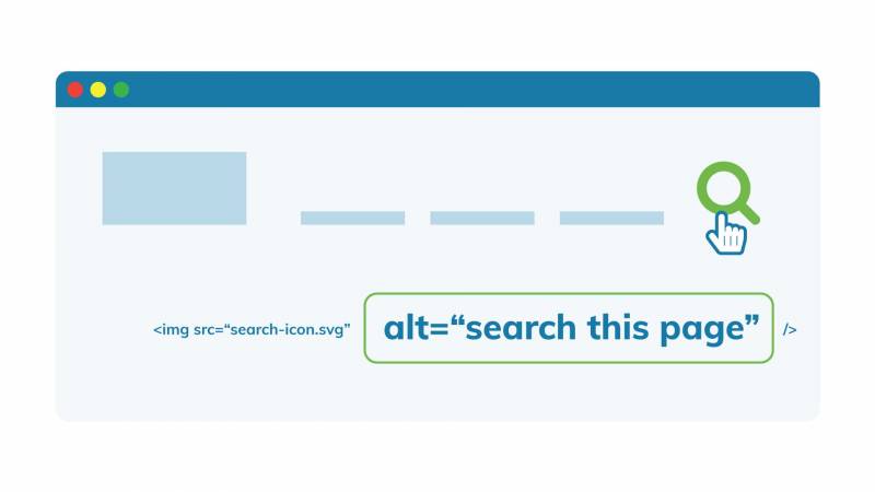
Functional images perform an action, such as opening a link. They should have alternative text that describes the action that happens when the user clicks that link. For example, "Search this page" for a magnifying glass that indicates a search function. Often, a brand logo is used as a functional image that returns users to the home page. In this case, the alternative text should indicate where the logo links to and can include the brand name as well: "Evolving Web Home."
2. Informative Images

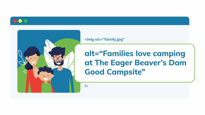
Informative images convey short information or concepts that can usually be expressed in a short phrase, such as "Young children playing baseball at City Park." Sometimes, an image is used more to convey a feeling or concept. For example, a picture of an all-smiling family camping at a campground can have alternative text such as "Families love camping at The Eager Beaver's Dam Good Campsite."
3. Complex Images

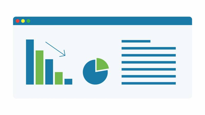
Complex images, such as graphs or diagrams, need to have alternative text that conveys the data or same information. In this case, it's best to provide a full-text alternative to the data contained in the graph. Also, for users who have trouble distinguishing colour, always be sure to indicate different parts of a graph or chart using distinctions besides colour, such as hashing. For further explanations on how to describe different types of complex images, The Diagram Centre is a great resource.
4. Images Containing Text
 Images containing text should include the text included in the image in their alternative text. However, other than the logo, as a general rule avoid embedding text in images or using images as text.
5. Decorative Images
" data-entity-type="file" data-entity-uuid="34acfb7e-fae1-4cd9-8160-d7edaad8ea50" src="https://evolvingweb.ca/sites/default/files/inline-images/05-decorative-images.jpg" />
Decorative images are the final type of image. These images serve no purpose other than to just look nice. They are the one exception to always having alternative text to your images and should have no alternative text.
If you want further details on how to write alt text, this blog breaks it down pretty well.
One Minute Summary
It might seem complicated at first, but images are one of the easier website components to make accessible. The key is to have appropriate alt text. As a quick recap, for the images themselves, make sure all images have a high enough contrast so they can be interpreted without colour and are zoomable. Next, use alt text to label them appropriately. Images that do an action should indicate the action in the alt text whereas those that simply demonstrate something should describe what they show. Images which are purely decorative should have no alt text.
Follow these tips and everyone will be able to enjoy your site. And if you need more guidance, join our upcoming Web Accessibility training.
+ more awesome articles by Evolving Web