
It's a lot easier to design an accessible website if you consider accessibility from the get-go, but we don't always have that luxury. You're far more likely to have an existing site on your hands, and, if you're reading this, you're probably wondering how to determine how accessible it is currently so you can get a better idea of what needs to be done.
Here's a simple guide to testing your Drupal site for accessibility. (Most of these apply to non-Drupal sites, too). We've divided it into 3 sections.
Jump to:
Manual Accessibility Assessments
Before you start jumping into automated testing solutions, go through your website manually to identify accessibility barriers. This is also a good way to develop your "accessibility reflexes".
Validate your code
For your website to be rendered correctly across devices and handled properly by assistive technologies, the underlying HTML and CSS need to comply with the latest web standards.
When it comes to your HTML, here are a few things to pay attention to:
- Closing tags, perhaps the most common cause for invalid code
- Attributes. The W3C recommends quoting all HTML attributes, even though it isn't technically a requirement.
- Semantic markup. Don't put content in a
when it should be in a
If you want a demonstration of the importance of semantics, open a screen reader and try reading these two pages:
- Good semantics (all HTML elements are used correctly)
- Bad semantics (uses presentational HTML, like
)
You can use the W3C's markup validation service and CSS validation service to check your site's HTML and CSS markup.
Test your site's keyboard accessibility
The browser version of your website was likely designed first and foremost to accommodate users who navigate by clicking around with a mouse, but that doesn't account for everyone. Make sure to provide a comfortable experience for people browsing with their keyboard or with a screen reader. Here's what to look for:
- Is there a "skip to content link" that lets users access the most important part of the page directly?
- Is highlight focus enabled to provide visual feedback regarding where a user is on the page? Also make sure that all focusable elements are actually interactive.
- Test any hoverable elements to make sure that the information revealed with a mouseover is also available to keyboard users.
- Tab through each page to make sure that there aren't any dead ends or "traps".
- Don't forget to test tabbing in both directions! Shift+Tab lets you tab backwards.
- Pay attention to the flow. If a page's visual layout is in a different order than the DOM, the keyboard experience might be disjointed and confusing.
Test screen reader accessibility
Screen readers like VoiceOver (built into MacOS) and NVDA (Windows) let visually impaired users navigate through websites by reading out loud the contents of each page. A 2019 survey by WebAim found that 79.9% of screen reader users with a disability relied exclusively on sound to navigate.
The best way to make sure the screen reader experience on your site is up to par is to download a screen reader application, fire it up, and navigate through your site. Before you do that, you can go through the basics:
- Do all images (except purely decorative ones that don't convey any information) have alt text?
- Does link text make sense out of context? Hint: commonly used labels like "click here" are too ambiguous. Keep in mind that screen readers typically say "link" before reading a link's text (meaning that someone reading this page with a screen reader would have heard "link: NVDA" in the first sentence of the paragraph).
- Make sure dynamic content changes (which occur without reloading the page, such as notifications or search result filtering) are "visible" to those who can't see them. If you're using Drupal, you can use the Drupal.announce() API, which uses ARIA live regions, to signal to screen readers that a dynamic content change should be announced.
This Web AIM article goes into detail about how you can use CSS to implement accessibility features for screen reader users.
Test colour contrast
Text should have a contrast ratio of at least 4.5:1 with the background to meet accessibility guidelines. There are many tools that can be used to test your site's contrast for accessibility. Here are a few:
- Contrast-ratio.com lets you input a background colour and a text colour and outputs their contrast ratio.
- Coolors.co's contrast checker does the same as the above, and provides additional information such as a quality score for small and large text (the smaller the text, the higher the contrast needs to be).
- Kontrast is a Chrome extension that lets you check the contrast of any element on a page against WCAG requirements, among other useful features.
Make sure your content is usable and complete with CSS and JavaScript turned off
There are all sorts of reasons why users might have JavaScript disabled or are otherwise unable to access JS elements. This tweet from Jake Archibald offers a friendly reminder:
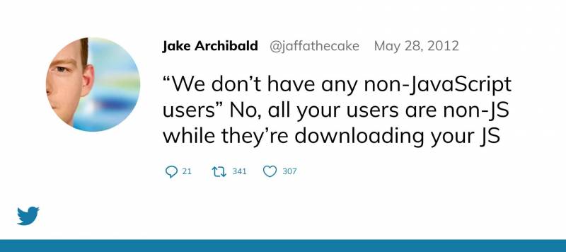
In any case, noscript users do exist, and you should make sure they get a coherent experience on your website. To turn off JavaScript in your browser to start testing your site, use the option in the developer tools menu, or get the Toggle JavaScript extension for Chrome for one-click toggling.
Chris Ashton at Smashing Magazine wrote an in-depth article called I Used The Web For A Day With JavaScript Turned Off, and I highly recommend checking it out to understand how your noscript users experience the web.
Similarly, make sure that your website renders properly without CSS styling enabled. This is especially important given that people can use their own custom stylesheets in their browser; make sure to use plain and proper semantic HTML so that pages keep their logical structure regardless of style.
Use WAI-ARIA where appropriate
WAI-ARIA markup can be used in certain circumstances to improve accessibility. For example:
- ARIA landmarks can make navigation easier for screen readers
- Adding ARIA attributes to HTML forms can improve their accessibility
- Aria live regions helps screen readers handle dynamic changes in content
- The
aria-hiddenattribute can hide things from screen readers while maintaining them visually on screen
To get a better idea of what accessibility pitfalls can be solved with ARIA enhancements, check out this excellent blog post, which features videos of screen readers making use of various ARIA attributes.
The Mozilla Developer Network provides excellent guidance regarding ARIA screen reader implementation.
General Accessibility Testing Tools
While most of the tools I've mentioned up to this point have a single precise function, there are also ways to check full web pages and sites for a variety of accessibility issues. Many of such tools exist, and they can save you a lot of time — but they work best if you fully understand what they're telling you. Running an overall accessibility audit without any prior knowledge or preparation can lead to overwhelming results that are difficult to prioritize.
Here are two of my favourite accessibility testing tools that you can run directly in your browser.
Axe browser extension
Here's how to use axe to test a page's accessibility.
- Download and install axe for Chrome or Firefox
- Navigate to the page you want to inspect
- Open your browser's developer console.
- Chrome:
F12(Windows),Cmd+Shift+I(Mac) - Firefox:
Ctrl+Shift+K(Windows),Cmd+Option+K(Mac)
- Chrome:
- Click on the axe tab, then click the Analyze button in the left-hand column
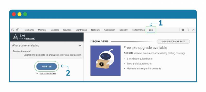
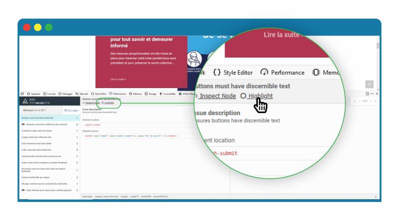
Once the tool is finished analyzing the page, you'll see a list of issues (and if you don't, congratulations! But chances are there will be at least a couple of things to fix). Click on any issue for more information, including its level of impact on accessibility (low, medium, high) and what you can do to fix it. Use the Toggle Highlight button to pinpoint issues visually.
Tota11y bookmarklet
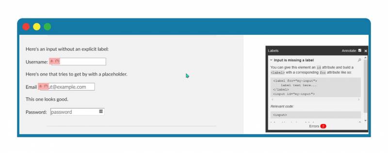
This nifty tool aims to make accessibility testing more, well, accessible by providing easy-to-understand visualizations of accessibility issues and annotations on how they can be fixed. To try it out, scroll to the bottom of this page and drag the tota11y button onto your bookmarks bar.
To run the tool on any web page, just click the bookmarklet. This will toggle a button at the bottom-left corner of the page, which expands into a menu:
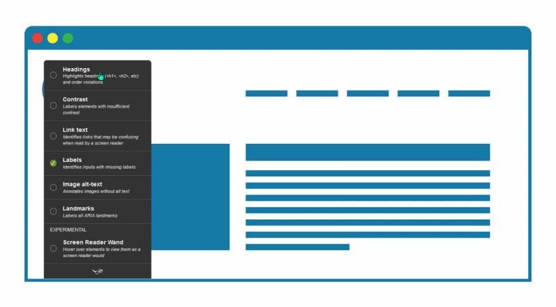
Choose what you want to focus on, and the tool will display any findings as well as show you where they are on the page, and what you can do to fix them.
Drupal Modules for Accessibility
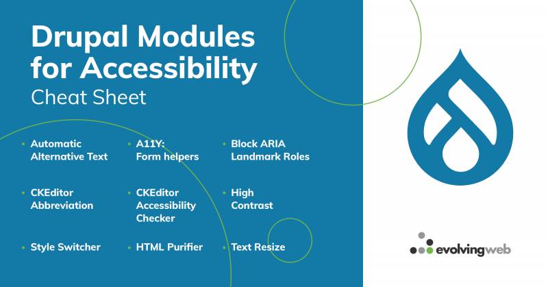
Not only is Drupal WCAG-compliant out of the box, but you can expand even further upon its built-in accessibility features thanks to a variety of user-contributed modules.
Automatic Alternative Text uses AI - via the Azure Cognitive Services API - to generate alt text for your images
Block ARIA Landmark Roles lets you assign ARIA landmark roles to elements of the block class
- Fluidproject UI Options lets your site's users customize their own accessibility settings, such as line spacing and text size, and saves their preferences via cookies
- High Contrast (in beta) lets site users toggle between regular and high contrast modes
Here's a full list of accessibility-focused Drupal modules.
Document the Process and Apply Newfound Knowledge to Your Next Project
As you go through the different steps involved in testing your site's accessibility, be sure to make notes on your findings and changes. This will help you internalize different accessibility notions that you should try to incorporate in your future web projects. Speaking of which, download our free accessibility ebook, or check out the rest of our accessibility series:
- What is Web Accessibility, and Why Should you Care?
- 7 Design Considerations for Accessibility
- What on Earth Is WCAG? Web Accessibility Guidelines Demystified
- How to Use Alt Text and Accessible Images to Create Maximum Reach
- 9 Easy Ways to Make Your Webinars and Meetings More Accessible
You might want to consider turning your notes into an accessibility policy for your organization, which you could even publish on your site as a statement of your commitment to inclusive web experiences.
Still aren't sure where to start testing? Want to brush up on your accessibility know-how? Need help crafting that accessibility policy? At Evolving Web, we make accessibility a top priority. Get in touch with us for personalized assistance.
+ more awesome articles by Evolving Web