Taxonomy is the process of classifying information. In Drupal, it’s also a powerful core module that allows you to assign labels to your content according to whichever patterns make the most sense for your site.
Let’s take a look at the different ways you can leverage taxonomies within a Drupal site and go over some best practices that’ll help you build your own system.
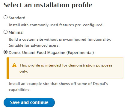
Tip: If you want to play around with Drupal taxonomies, set up a free test site on Pantheon, deploy the most recent version of Drupal, and choose the Umami demo installation. You'll get a prebuilt recipe site with some taxonomies already in place to help you quickly get started.

What are taxonomies used for?
Taxonomies are the backbone of everything from navigation menus to views and display options.
You can use them in workflows and to manage access to different types of content within your organization.
The main use for taxonomies, in most cases, is to relate pieces of content together—in a recipe site, you might want to organize by cuisine or by main ingredient, for example. Creating taxonomy vocabularies will enable you to do this.
How taxonomies work in Drupal
In Drupal, the taxonomy system (which you'll find under Content ➜ Structure in the Admin menu) is made up of vocabularies, which each comprise a series of terms. For example, "red", "blue", and "green" are terms you might find in a "Colours" vocabulary.
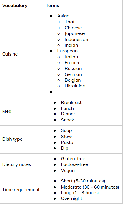
To illustrate this, here's a snapshot of some of the vocabularies and terms that might be involved in a recipe site.

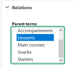
Notice that you can easily create hierarchies within your sets of terms. In our above example, Cuisine is broken down into continents, then further into individual cultural origins. To do this in Drupal, first create the parent term. Next, create the child term and scroll to the Relations toggle, where you'll be able to select the appropriate parent.

Child and parent terms can provide extra flexibility, for example by allowing visitors to either browse all dessert recipes or peruse only pie recipes, depending on what they're looking for. Nested taxonomies can be a bit tricky, though—more on that (and the four letters that can fix it) in a bit.
Structuring your site’s taxonomies
Recipe sites are a convenient way to illustrate the concept of taxonomies, but your site is probably a bit more complicated. So how do you figure out taxonomies for your content? Here are some tips.
Define your ‘things’
What types of information are featured on your site? In other words, what’s your business’s equivalent to Cuisines, Meals, and Dish types?

If you have a blog or other educational content (product documentation, for example), that’s a good place to start. Your blog covers all sorts of different topics—break them down into around 5 main themes, and you’ve got yourself the terms you need for a Category vocabulary.
Some posts are tutorials and others are interviews? Maybe you need a “Post types” vocabulary. Do you have videos, ebooks, checklists, or other types of resources? That looks like a "Formats" vocabulary. You get the idea! Card-sorting workshops are a great way to figure this type of thing out with your team.
📰 Read next: What you can learn from Marie Kondo about running a content audit
Identify relationships
Do you serve more than one industry? Your site likely has landing pages targeting each one; same goes for your educational content. Wouldn’t it be nice to automatically display your latest restaurant-themed blog posts on the main landing page for your restaurant audience? You can do just that by creating an Industry vocabulary and configuring a view on your page.
Speaking of blog posts, who writes them? Your team members, who already have their own profile on your website? Put that information into a Team vocabulary, and you’ll be able to easily do things like include the author’s headshot, mini-bio, and profile link on all of their blog posts.
Think ahead
I was once tasked with reorganizing educational resources for a company that had at least 100 categories for around 3-400 pieces of content total—not to mention a completely different categorization system for each type of resource (blog, documentation, FAQs, videos, ebooks, etc.).
This meant duplicates with slight spelling discrepancies, a search interface with more filters than results, and all sorts of other less-than-ideal conditions for both editors and visitors. Redesigning that site’s taxonomy with a more useful system of contained vocabularies was a huge, painstaking undertaking—we essentially had to start from scratch and relabel everything manually. In the end, it was well worth the effort, but we learned a valuable lesson: this type of problem can fairly easily be avoided by creating well-defined vocabularies that are able to scale.
You probably already have a decent idea of the vocabularies you could create for your site. The following concepts will help you refine your taxonomy system and prepare it for future unknowns.
Key taxonomy concepts and best practices
Mutually exclusive, collectively exhaustive—MECE for short—is one of the core concepts of information architecture, and it’s extremely powerful once you understand it. Let’s start by breaking that down, and then review some key things to consider when building taxonomies for your site.
Mutual exclusivity
Mutually exclusive means that all items within a specific vocabulary and on the same hierarchical level are completely unique - there’s no possible confusion between categories.
Having both “Video” and “Animated short” in the same “Content format” vocabulary, for example, is a good example of non-mutually-exclusive terms that can be problematic if they’re presented on the same level. Eliminating the problem is as simple as making “Animated short” a child term of “Video”.
Collective exhaustivity
Collectively exhaustive means that taken together, a vocabulary’s items represent the entirety of that vocabulary’s scope. This is where scalability comes into play. If you build them correctly, your vocabularies’ contents will be collectively exhaustive in relation to the current state of things—but that doesn’t mean this won’t change tomorrow.
Make sure that there’s room in your vocabularies for potential new terms you might need to add down the line. Always ask yourself: if you were to incorporate a new topic on your blog, a new feature in your documentation, a new type of media in your resource library, would it easily fit into your existing vocabulary?
The MECE principle doesn’t apply everywhere, however. You might decide, for example, that it’s fine to put a single piece of content in two different categories, or that content editors can use as many tags as they see fit on their articles. Always think in terms of your specific needs and goals, and feel free to break rules that you fully understand.
Breadth vs. depth
Your main categories showcase the breadth of your content—together, they represent the full scope of topics covered on your site, much like the list of a newspaper’s main sections.
Additional metadata, like sub-categories, tags, formats, etc., allow visitors to explore the depth of your content ecosystem according to their own mental model.
Aeon, as we saw earlier, first presents visitors with five broad topic sections. Sub-categories are used on each section's landing page to showcase the breadth of each topic in context, without creating information overload. This presents each reader with the option to dig deeper into what's most relevant to them when it makes most sense.

Topic-based classification schemes like this are just one possible structure among many, and it might not match your use case. In any case, the main takeaway is that you should aim for your taxonomies to support both your content’s breadth and its depth.
Understandibility
I’m not sure this one is a real word, but that doesn’t matter too much—what really matters is that you understand what I mean. The same goes for your taxonomy terms: make sure the meaning of public-facing labels is crystal clear to the people who’ll be interacting with them.
When we were redesigning the website for the Princeton School of Public and International Affairs, one challenge was the widespread presence of complex, niche language that’s typical in higher education. For each piece of academic jargon used by internal researchers and communicators, for example, we had to ask ourselves how the site’s audience—notably policymakers—would express that same idea. These “translations” were a necessary step to ensure that the site’s content was understandable to its target audience.
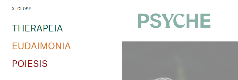
Another thing to watch out for is using key navigation aids on your site as places to express your brand’s personality. Having main navigation menu items labelled “Fauna”, “Forest”, and “Witchcraft” might play into your aesthetic, but your audience is expecting “About us”, “Locations”, and “Previous work”.
That’s not to say that bland is better, though! In cases like this, you could choose to switch to unambiguous language, but you could also simply provide some explanatory text near the label.

Learn more about taxonomy in Drupal
You should now have a basic understanding of what taxonomies are for, how they’re implemented in Drupal, and how you can use them to organize your site’s content and improve user experience.
If you’re interested in taking a deeper dive, our Drupal Site Building & Architecture training give you an in-depth look at how taxonomy fits into your overall site and interacts with other front-end elements.
+ more awesome articles by Evolving Web