
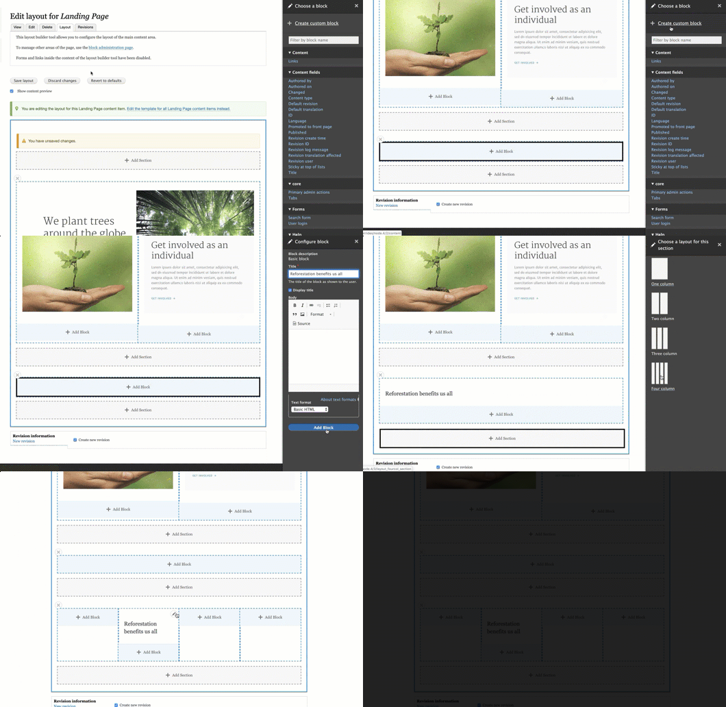
The Layout Builder is one of the most exciting new features in Drupal 8. It's a site building tool that makes it easier to configure how your content is displayed in Drupal. You can use a drag-and-drop interface to combine fields, nodes, and other content, and actually control the layout used to contain that content.
You can also use it to build landing pages from the ground up: creating custom content blocks and placing them where you want in a layout. I was curious about how content editors would react to the Layout Builder interface, and if they would be able to easily build a landing page in this way. I did a short user test at DrupalCon Seattle and the test subject (an experienced Drupal content editor with a lot of patience) had a hard time figuring out where to start.
That's how this comparative study came about. The goal was to see how content editors use the Layout Builder, in the context of creating landing pages. My colleague Annika Oeser created a script and conducted the user testing, my colleagues Michiel Huiskens and Jigar Mehta set up the configuration in Drupal, and Sean Conner at Charles Shwab helped us recruit volunteers for the study.
A lot of work has gone into the Layout Builder already, and the user interface is undergoing constant improvement. This study specifically addresses the use case of content editors creating landing pages using the Layout Builder.
The Setup
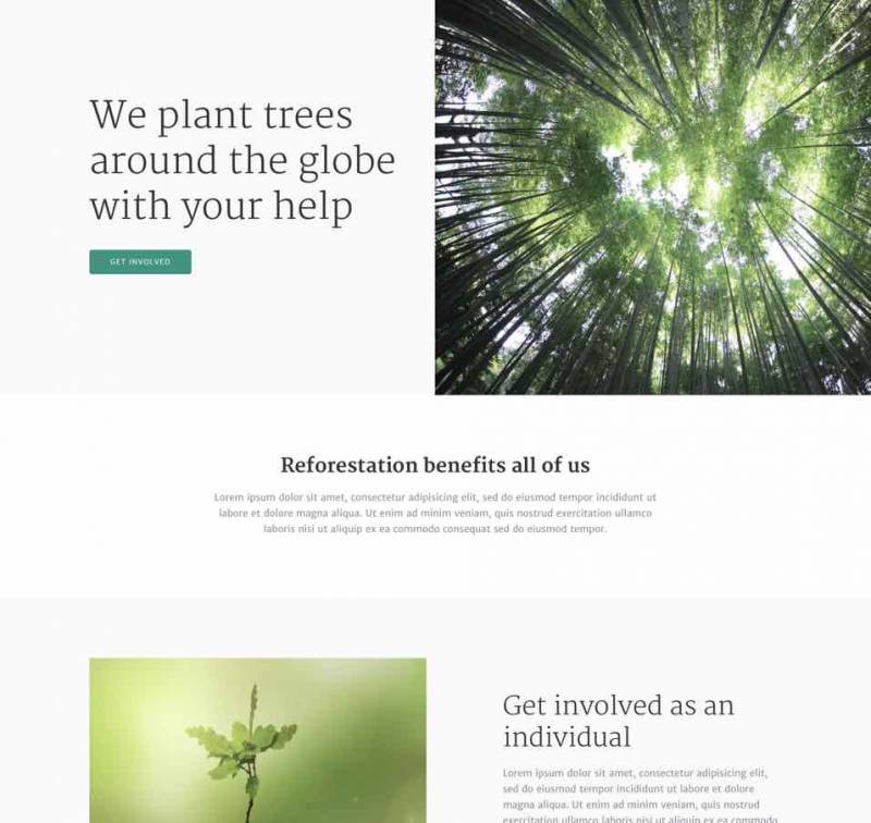
To organize the study, we created a mockup of a simple landing page design. Our main instruction was open-ended: asking participants to create the landing page following the design we provided, and then move some of the content to the top of the page.
We had all the study participants do the task using Drupal with the Layout Builder and, as time allowed, also tested how they used WordPress with Gutenberg and Drupal with Paragraphs to give us some benchmarking.
We created three demos sites:
- Drupal with the Layout Builder: we configured a landing page content type that has no fields, and the Layout Builder enabled on a per-node basis. The site includes block types to model the content components that appear on the landing page: text, image, call to action.
- Drupal with Paragraphs: we configured a landing page content type and Paragraph types for the content components, as well as nested paragraph types like "2-column wrapper" to allow the content editors to build the layout
- WordPress Gutenberg: No custom configuration
First Impressions
As one participant said, "the biggest question is: 'Where do I create content?'"
Although at first, many participants asked themselves what the difference between a Block and a Section is, they were all able to quickly figure out the model of adding Sections. And they found that selecting the layout for a Section was easy.

Adding Blocks
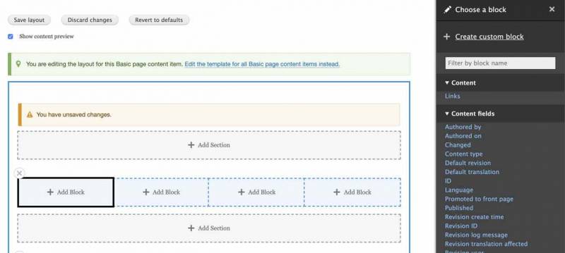
Clicking the "Add block" link was obvious to all the participants, and once they found the "Add custom block" link, they had no trouble using this to populate their layout with content. However, along the way, they found a few aspects of the UI confusing:
- All the participants observed that "When you go to add [a block], it's confusing to have all these options." The "Add custom block" link gets lost, even though it's at the top of the list.
- Once the user selects "Add custom block", they can guess which block type to use, but it would be nice to have a way to explain the difference between the types. Block type names like "Text", "Call to Action", or "Basic Block" are abstract and hard to differentiate.
- After adding several custom blocks through the Layout Builder, one user looked for a "Block Library", because he wanted to reuse one of the blocks he had just created.
Editing Blocks
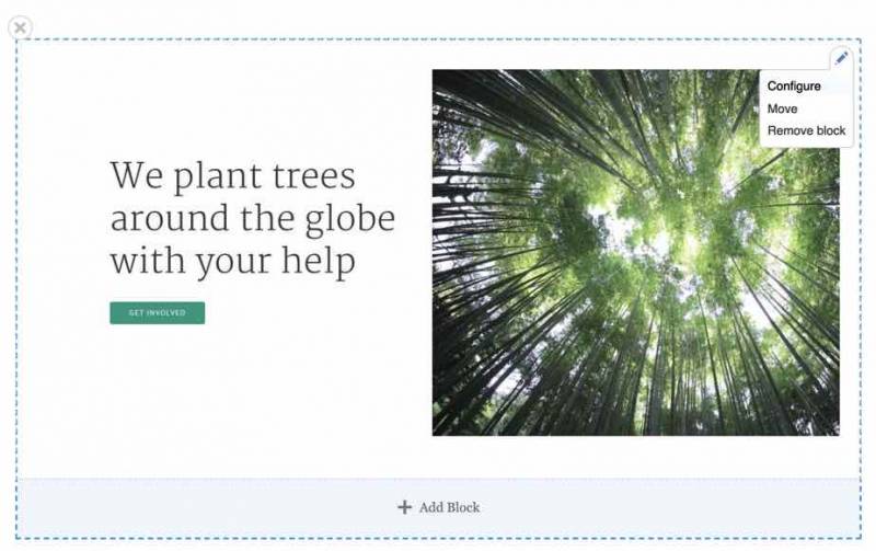
The most common complaint we heard about the block editing interface was about the word "Configure" when editing the content of a block. Content editors look for the word "Edit".
Another thing that content editors found confusing was the "Display title" checkbox next to the title field. Many participants asked "What is [the title] used for if it's not displayed?" In the case of adding custom blocks through the Layout Builder, it seems like the content editor shouldn't have to make this decision. And it would be nice if there was a clear way to indicate to the user what the purpose of this field is if it's not displayed.
Other feedback included:
- When editing a block, there's no "Cancel" button, only an "Update" button.
- "When I [double-]click on the content of a block, I feel like it should go into edit mode, like MailChimp."
- Using this method of having custom block types to construct a landing page, the onus is still on the site builder to configure the fields that are well-labelled and easy for content editors to populate. So we heard feedback like "I would like for the default [text format] to be Full HTML."
Editing the Layout and Sections
Learning how to use the Layout Builder involves learning new terminology, and how to manipulate the Blocks and Sections. We heard several observations about this experience:
- One feedback we heard many times was that the links to "Add section" and "Add block" should look more like buttons. This could be helpful because when the participants tried to drag-and-drop blocks on the page, they tried to move blocks into the "Add section" areas, because these look like part of the layout.
- One user noticed that the "Add section" links "interfered" with her layout. Another user said "'Add section' feels intuitively like a place I should be able to put something."
- Once a Section is created, it's hard to tell that it's a section, which can add to the initial confusion about the difference between a Block and a Section.
- Also, when trying to move content from the bottom to the top of a layout, one participant said "It looks like the sections are movable. But I don't know how to select an entire section."
Findings About the Overall UI
Configuring the permissions for content editors to limit what they can do will be key to making the overall interface less distracting and easier to use. Some specific observations about the overall UI:
- One participant clicked on the "Edit the template for all Landing Page content items instead" link. The interfaces are so similar that it wasn't clear to her what had happened and she continued editing as if she were editing a single landing page node.
- Having the publishing status more visible on the "Layout" page would be helpful.
- Having the "Save" link at the bottom of the "Edit" page, and the "Save Layout" link at the top of the "Layout" page seemed disorienting.
- The fact that your default Layout can't be empty means that you have to have one block in the layout when the content editor first clicks on the "Layout" tab. This block prompted some questions and mild confusion from the content editors.
Comparison with Paragraphs and WordPress Gutenberg
When trying to create the same landing page layout with Paragraphs, participants found:
- The nested-Paragraphs interface we provided for creating the two-column layout was more confusing and less flexible than the Layout Builder.
- The Paragraphs interface is more familiar for someone who is used to working with the Drupal fields. Using Paragraphs was faster for creating and editing content.
- One participant observed that "Paragraphs works well if you have simple content, but once the content and layout is complex, then it gets bloated. I would be curious to see how the Layout Builder handles complex content like that."
Comparing WordPress Gutenberg and the Layout Builder:
- Participants observed that the two interfaces offer similar features and work in a similar way.
- With Gutenberg, some of the styling options are hidden, in order to make the interface more sleek, and this can make it harder to find content editing options.
- Gutenberg provides the flexibility of adding a wide variety of types of content to a landing page, while the Layout Builder allows (and requires) the site builder to pre-define the set of block types that can be added.
What Did We Learn?
One of the most interesting things we learned in the study was the workflow that content editors use. One said "I would like to be able to preview my layout before I start adding content to it. Just like a blank template [that I can send as a preview to my colleagues]." I noticed that some participants created the landing page in two rounds: first adding the content, and then doing another round of work to try and get it styled correctly by using the WYSIWYG and changing block types.
By the end of the testing sessions, all the participants were able to easily add/edit blocks. But getting used to the layout tools and figuring out where to go to add custom blocks in the first place was difficult for all of them. I know that controlling the list of available blocks is on the roadmap for the Layout Builder, and I think this will help immensely.
Although all the editors were able to figure out how to use the "Layout" tab, orienting the whole content editing process around the "Layout" tab would be helpful for editors. As one participant observed: "My habit is to go to the "Edit" tab, but all the useful things are in the "Layout" tab."
Terminology is hard to get right, and even harder to change. I think it's hard because what we call things change depending on what role we play. One very observant participant said "the word 'Block' is throwing me. To me, it should be content. When I have my content editor hat on, I'm looking for a link to add content." Likewise, content editors look for the word "Edit" instead of "Configure".
I hope these findings are useful for understanding how content editors think, and will be helpful for improving the UI of the Layout Builder for this use case. I also hope that site builders and developers can use this input create better configuration and documentation as we start to use the Layout Builder on our projects. As one content editor exclaimed at the end of the testing session "I'm excited about this new feature!"
+ more awesome articles by Evolving Web